For this task we had to develop a brand name for a dog food product and go through the logo creating process.
Exploration
During this stage the designer has to examine a range of different approaches and investigate each of these approaches and recognise their potential.
As I was doing research on dog foods, I noticed that many (if not most) of the brands are quite neutral when it comes to the brand name.
The following brands do not have any mention of dogs:
- Purina
- Hill’s
- Orijen
- Yora
- Josera
- Asana
- Blue Baffalo
- Edgard Cooper
- Mac’s
- Merrick
- Victor & Sage
- Iamso
Then, there are those with some reference:
- Pedigree
- Wag
- Hungry Bark
- Barking Heads
And only a few specifically mentioning dogs:
- Farm Dog
- Pooch & Mutt
- Happy Dog
- Pupper
Initially, I was thinking of a brand name that either had the word “dog” in it like “Happy Dog” or reference to dogs/dog food such as “Hungry Bark”.
My initial ideas for a name were:
- Barking Bites
- Doggy Bites
- Doggy Bag
- Happy Doggy
- Dancing Dog
- Waggy tails
Out of these, I liked Doggy Bites the most so I did some sketching for this idea. However, when I saw that the majority of the brands were not making their brand name so evidently dog related, I thought this would be worth experimenting with as well.
As I was sketching and looking for inspiration, I drew a simple side-view silhouette and I ended up liking this the most. This did not match well with a cutesy name so it was time to look for another name idea as well. This time I hoped to find something that sounded neutral but had meaning behind it.
I looked at the following greek names:
- Alyx
- Alexis
- Alister
- Allistair
- Allistar
These all mean “defender of man” or “protector”.
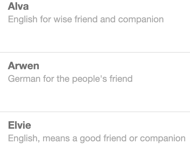
I also looked for names that mean “friend” or “companion”.
My sketches are unfortunately always a mess; however, I feel that not putting too much pressure on myself in this stage helps me generate ideas more freely.
Use sketching techniques to draw thumbnails and hand in your thumbnails as scanned PDFs.
Focus
Now compare the results of the exploration stage. Evaluate the different concepts and decide which one will be the most interesting and offer the best results. You can even combine different concepts to form a new one. Once you have more direction, you can start visualising your design.
I decided to ditch the Doggy Bites idea as I don’t like the name or my logo ideas for that concept and I feel that the other idea is closer to my personal style.
- Highlight three of the thumbnail ideas that you consider the best options and state why. Hand in an A4 with visuals of the three chosen thumbnails; include reasons for choosing each of these three options.
I like the name Alister the most, but I have not decided on the spelling of the name yet.
Construction
The designer integrates and “builds” the components of the form and composition, working with the attributes he or she has selected.
- Construction – Use sketching techniques and redraw ONE of your chosen concepts until you’ve reached a conclusion on a successful logo. Hand in your drawings as scanned PDFs.
I am most satisfied with #8.
Testing
As the drawing takes shape, the designer experiments with variations in scale, rhythm, position, etc. This helps the designer to determine if and how these options confuse or clarify the design.
- Testing – Experiment more with your favourite options from Step 3 and ask the opinion of a few people. Hand in examples of the logos shown to people and write their feedback or opinion on each.
Feedback from others:
- too empty, feels unfinished
- feels incomplete (especially next to the curve), it’s missing something
- What is this – a communist dog?
- This one looks good. The star kind of looks like a treat that the dog would be looking for. This logo would work well for dog treats, especially if they are star shaped. This is more playful. Second best.
- It’s unclear what the 3 stars represent/mean. What is their purpose?
- not shown
- not shown
- Looks very clean, more professional, feels complete, would fit different types of dog food items
Not to be confused with “clean‑up” or the mere simplifying of artwork, this stage is about editing the form to clarify relationships. In other words, it’s about bringing the design to a stage where it appears to be purposeful and somehow “complete”.
Refinement
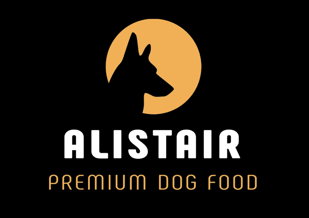
- Refinement – Choose your final design and execute it in Adobe Illustrator, along with the name of the product. Hand in your final logo as an A4 PDF.
Product: Logo development
Brief: The goal was to come up with a dog food brand name and design a logo.
Brand Name: Alistair
After some feedback, I made many more changes, which are below.
No responses yet