Surf the web and find one good example of a website that uses hierarchy to guide the viewer’s eye on the homepage.
- Explain how visual hierarchy was achieved (scale, colour, spacing or contrast) and mention the viewers pattern if there is one.
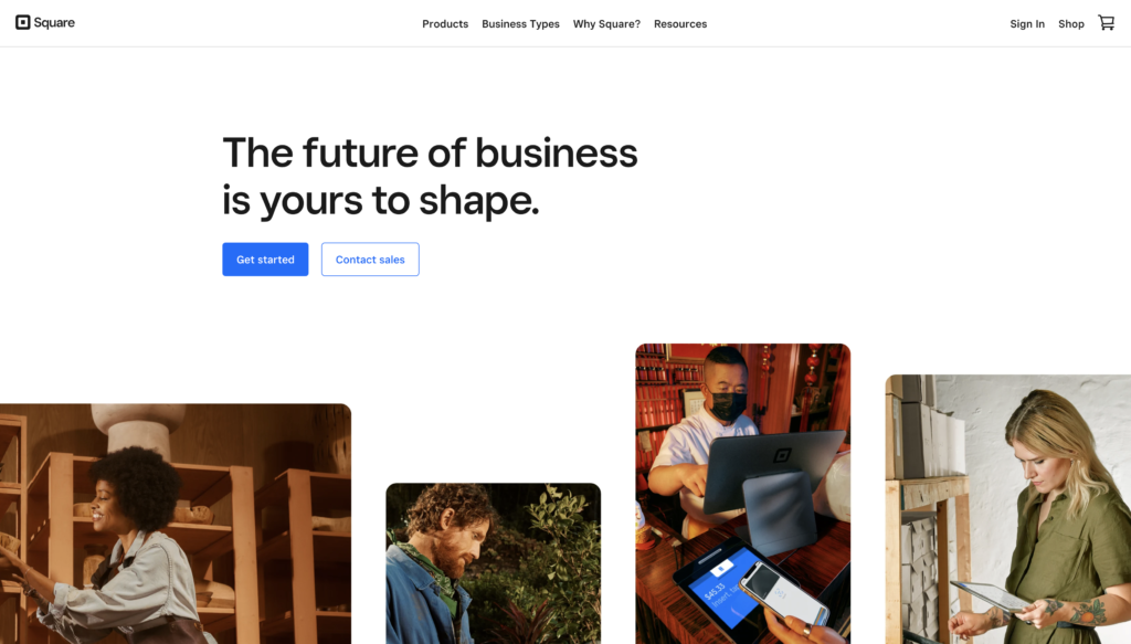
It appears to me that this site has good visual hierarchy. I first read their tagline “The future of business is yours to shape”, which is there to create confidence and trust in the company. After reading this, I started scrolling down to see exactly what the company offers. They use positive images to create positive feelings, which also helps to visualize the product in use and rest the eye a bit so viewers are not overwhelmed with a lot of text.
Scale: They have a lot of information to share and it is shared in a way that is easy to digest. Headlines are quite large and eye-catching, the rest of the text is well proportioned according to importance.
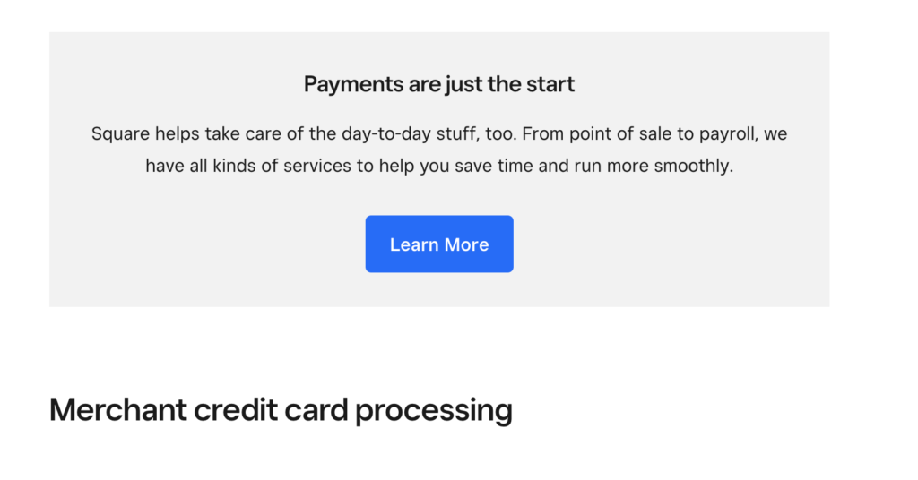
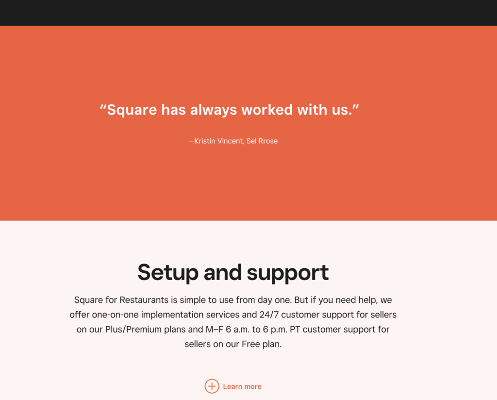
Color: Color is utalized well to create hierarchy. White is used for the background most of the time with black text. At times this is flipped, which creates a strong division and brings the information they want to share into focus. A vivid blue color is used sparingly as a highlight and stands out well against both the white and black backgrounds. It guides the viewer to important information and action steps. This eye-catching color separates the information well and brings important elements into focus. There are some pages, although very few where a red-orange color is used similarly to the blue. In addition, there are some greys and very light versions of the blue and orange used, mainly to separate and hold information.
Spacing: They have the different services clearly divided so it’s easy to find what best applies to the person viewing the site. Within the different categories information is well divided. The spacing between topics make it easy to separate information and get a good overview. They use a lot of negative space as well, which is easy on the eyes and makes the site look more high-end.
Contrast: The colors and different font sizes used creates high contrast which makes the site easy to view and understand the information presented. They have good order of importance and clear areas of focus.
Pattern: My pattern as a viewer was scrolling downwards for more information as this is the order in which they share their information. They use strong contrast to divide topics. This is true not only on their homepage but under the different categories as well. The headlines really stand out as they are bold and large, so that is the first thing I view or the image it is placed on, if there is one. Then, I scroll down and click on the information I need.
- Take screenshots and use the colour picker in Photoshop or Illustrator to put together the website’s colour palette.
Screenshots:


Color Palette:
- Describe the use of colour in terms of primary, secondary, and accent colours.
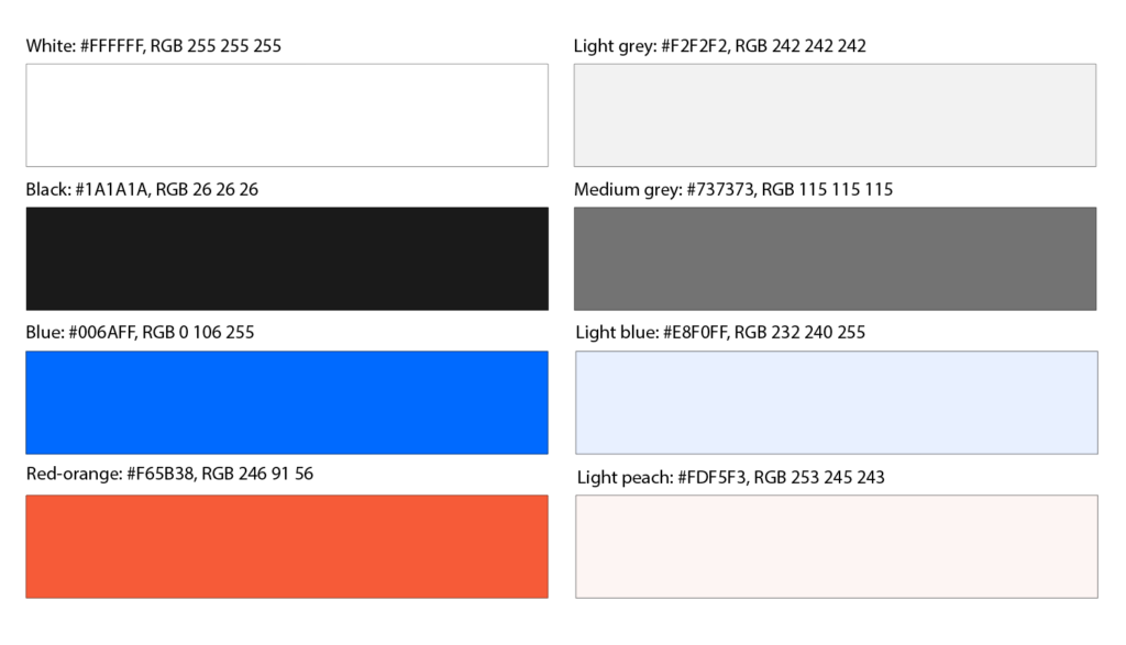
White is a primary and is used mostly as a background or sometimes for text.
Black is secondary and is used mostly for text, it is most prominent in the headings. Sometimes the color scheme is flipped for a certain section or page of the site and the background is black while white takes the secondary role for text.
Dark grey is also used for text at times to help separate information even more.
Light grey is used for buttons, blocks, containers, or sometimes as a strip across the page to hold/ highlight information.
Blue is used sparingly yet it stands out as “the color of the site” and adds visual interest and character. It is a highlight color used mostly for call-to-action buttons and to highlight important information. Once in a while it is used as a background color on certain pages.
I almost did not notice the red-orange color because most of the site does not use this color, but it does show up on a few specific pages (https://squareup.com/us/en/point-of-sale/restaurants/bars) where it is used as one of the main highlight colors. It works well with the rest of the color palette.
I only came across the light peach a couple of times used as a strip across the page holding information. It is used on those specific pages where red-orange is used as a highlight.
- Use screenshots to show and discuss the different text styles and choice of fonts for these (mention at least the H1, button and body text styles).
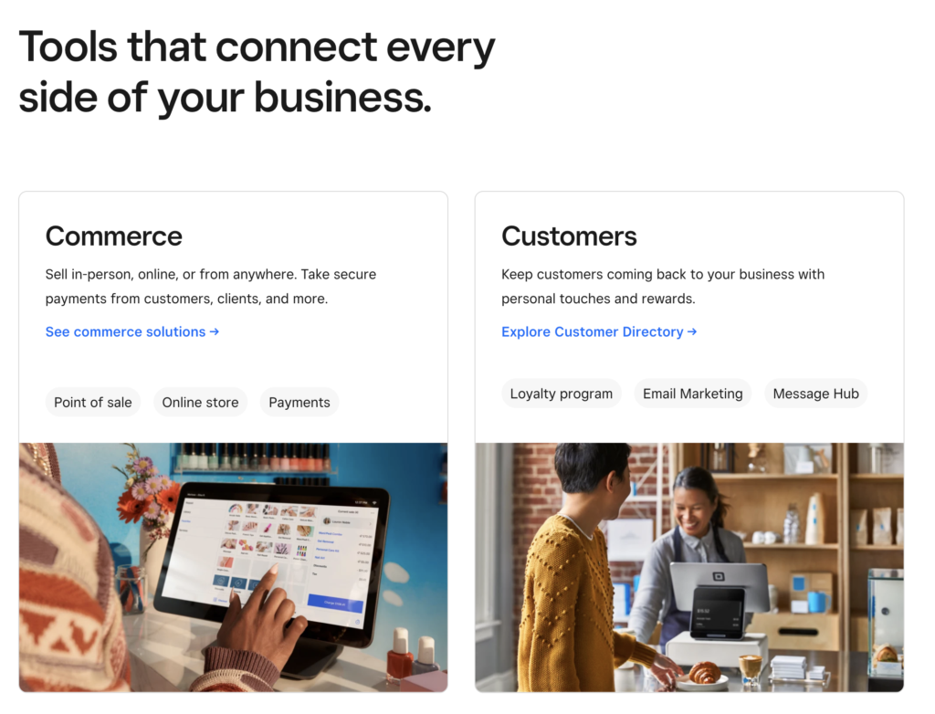

The site uses simple sans serif fonts and the legibility is excellent. The sizes of the text vary depending on importance. There are many different sizes and it’s hard to tell if the fonts are different, so they work well together.
Heading 1 (H1) – they use a bold sans serif font in a large size
- font-size: 100px
- line-height: 112px
Heading 2 (H2) – the same font and weight is used as for H1 just smaller
- font-size: 48px
- line-height: 56px
Balance text H6: text that is made large but the font is not bold – it is used under headings, separate from body text
- font-size: 28px;
- line-height: 38px
Body text – this seems to vary depending on the page, but is also a sans serif font, regular size and usually black
Buttons – also use a sans serif font in regular size and weight, the color varies, but it is the background color that brings attention to the buttons.


No responses yet