For this task, we were give two restaurant options to chose from and I chose Syam Kraw (Thai Kitchen).
The task: Use the questions from the lesson ‘Website Design Brief’.
What kind of visitors are you expecting on your website? Consider their income, interests, gender and age.
Average/middle income
Male and female
People who like thai food, asian flavors, are interested in thai/asian culture, or are generally open to trying different types of cuisine
Who are your competitors and how do you differ from them? What can we learn from their websites?
Competition: Other thai food places are the biggest competitors, but also other asian restaurants and similarly priced restaurants in general.
How they differ: They are open Mon-Sun while many restaurants are closed on Sunday.
Several other thai food places in town are street-food trucks, but they have a location so people can dine in.
They believe that the quality of their food is better than most Thai restaurants, but in order to uphold this their menu had to be kept smaller. Most Thai places have extensive menus, so this could be looked at negatively, but their goal is to distinguish themselves, level up, and make sure that their ingredients are fresh and high quality while maintaining reasonable prices. Good marketing is required to help people understand their approach.
They hope to make a change and distinguish themselves better. They now understand that the food, while perhaps most important, is not the only factor attracting people. They have a decent customer base which mostly consists of Thai people, but how they appear to those who are new to Thai food and trying the place for the first time has also come into focus. They want the website to help elevate their game when it comes to attracting new customers and help expand their business. The new website plays a major role in building their brand identity.
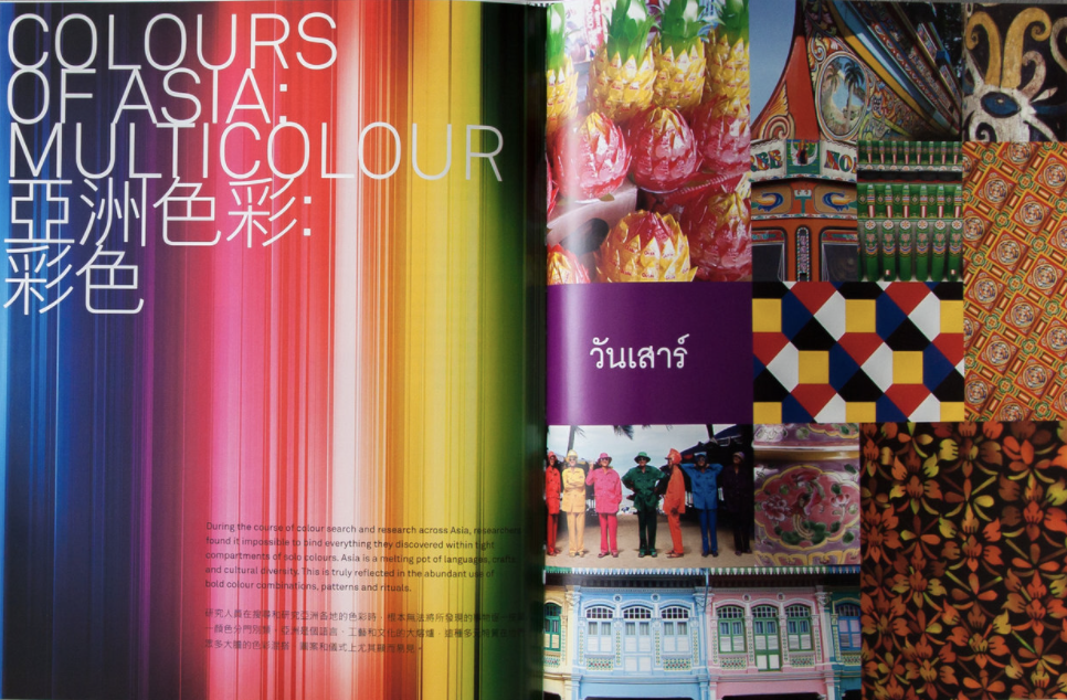
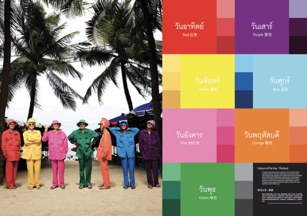
They came up with the following plan to differentiate themselves: in addition to their regular menu, they will have one special dish each day. These dishes will each have a dominant color for the following reason: “In Thailand, it is widely believed that dressing in a certain colour each day will bring you good luck. The code is: Monday, yellow; Tuesday, pink; Wednesday, green; Thursday, orange; Friday, blue; Saturday, purple; Sunday, red.” – They will follow these guidelines and create a unique dish for each day of the week where these colors will be represented.
Their new marketing strategy, and therefore the website, will also be built around this idea.
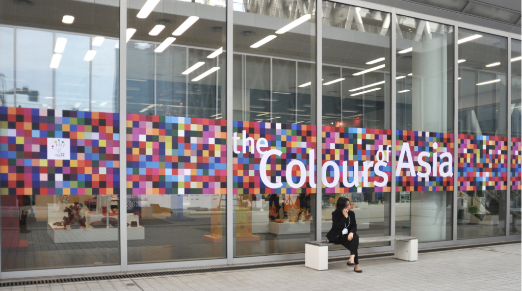
Some of the inspirational pictures are:
What is your deadline for completing the site? How big is the budget? Talk about realistic expectations and options.
We have 2-3 months to complete the site. Two months to have it mostly done and one month for additional changes and tweaks before launching. The budget is low-medium, so we are going with a medium-priced website host, the site will not be built from scratch. Order options for take-away or delivery will be shown on the site, but it will be sourced out to Foodora.
What actions do you want visitors to take on the site? Think about the functionality you want on the website.
The main action they want people to take is to order food or visit the restaurant. They want the website to help build trust in the customer regarding the quality of their food and service so people would choose them over other places.
Most of the site will be static, except for table reservation. Take-away orders can be made by phone and online through Foodora. Delivery will only be available through Foodora.
They want their contact information, especially their phone number clearly visible for orders by phone. They also want their location and helpful information about how to find them on the site.
In addition, they want people to look through their site and be inspired by high-quality images of tasty food and fun images advertising them as a business that stands for quality and excellent customer service.
What features should be used on your website? This includes contact forms, pictures, videos, etc. Some clients may know exactly what features they would like, while others might have no clue. Guide them by asking questions and showing them examples of other websites.
The following will be needed:
Pictures – needs to be high quality and authentic, so it was decided that a professional photographer will take images at their restaurant (menu items, staff, restaurant, cooking photos, etc.)
Pages on the site: Home, About us, Menu, Take-Away and Delivery, Location and Hours, Reservations
The logo should be placed in the left-hand corner of the site next to the menu bar.
Below the menu bar, the home page should have a big image with the restaurant’s tagline.
List the names of three websites you like and explain what you like about them. Next, ask the client for their thoughts; ask them to point out their likes, dislikes and expectations on the website examples. This step can save you valuable time and money.
In this case, I looked for websites of Thai restaurants so they could better relate. It was actually quite difficult to find good ones. These were the best ones I found:
Nipa Thai Main Page
Positive: Very simple but good quality site. I like the images, fonts, and the simple layout. I also like that each section is kept quite short and that I can select what I am interested in in the menu bar, but the same information is shared just by scrolling down (people might be more likely to read through the information this way, which could create more engagement.)
Negative: I don’t think it’s very negative, but their menu is a pdf. I think this is fine as it helps to keep the website short and to the point. It is also helpful that this opens in a new window. However, it’s also nice when a website has a page dedicated to this. Also, if the restaurant would want to share more information, this layout would not work so well, it would be then preferred to have different pages for each item on the menu bar.
https://www.sabaithai.nyc/ –
Positive: Their home-page is very inspirational. They use images well and share important information about Thai food and their services on the home page. I also like that this site has the menu listed on the site rather than shared as a pdf.
Negative: Their “order online” page does not work. Reservation is sourced out. When I click on these options in the menu bar, the page goes over to another site. I think it would be better if these automatically opened in another window while keeping you on original site as well.
https://www.nanfinedining.com/
Positive: High quality images and good information. Menu listed on site not as a PDF. Their social media pages open in another window.
Negative: On the “Make a reservation” page I did not notice where I can do this right away, instead I noticed other information with big headings such as “CONTACT”, “DRESS CODE”. These were sort of shouting, so much so, that I did not even notice the reservation section which was right in front of me. Perhaps is this has a different, more noticable highlight color (not grey), it would stand out more.
A few extras:
https://www.kindeum.com/
Do you have a brand manual or brand guidelines? Make sure to obtain any vector or high-resolution logos, stock photographs and brand elements available.
The restaurant had a logo and a menu design created, however, they did not have brand guidelines before. However, these have not been created based on the marketing strategy mentioned above. The new logo and brand guide will be used when creating the site.
Do you have any colour preferences? What should the look and feel for the website be? Since colour is subjective, a client may not have the same colour preferences as you do. It is a good idea to put together colour palette options and present them to the client at the start of the process. This will guide them visually and help you understand their preferences.
This image shows the colors and the and the feel for the site.
What do you NOT want on your site in terms of text, content, and graphic elements? Sometimes it is as important to know what your client doesn’t like, as it is to understand what they do like. This can help you get a complete picture of what the client has in mind for the site.
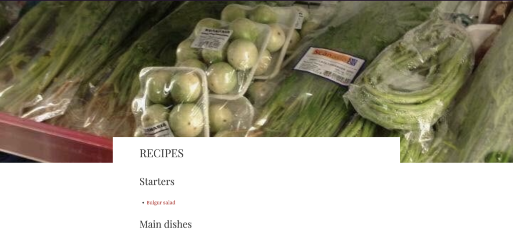
Photos taken with a point and shoot or phone
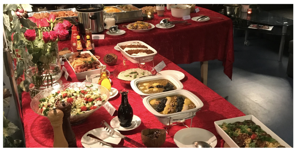
Blurry/bad quality and unappetizing images:
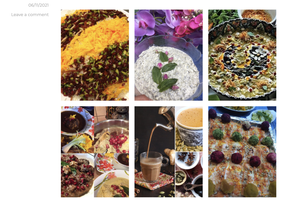
Photos in squares with spaces between them
Emojis
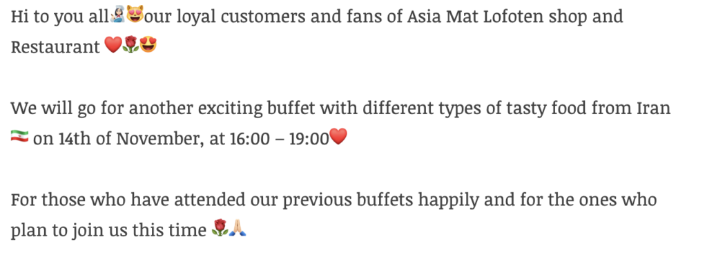
Source: https://asiamatlofoten.no/
No sarif typefaces
No flashing buttons or gifs
Who will be the contact person for this project? Ask the client for one contact person to deal with if you have questions or need feedback.
The restaurant manager and owner will be my contacts.
Who will be responsible for maintaining the website? Will the person have the time and skills to do so? Discuss possible training of responsible individuals within the client’s company, or draw up agreements if you or your team will provide maintenance as part of an ongoing service.
The restaurant manager and assistant manager will be responsible for the site. The goal is to make it as maintenance-free and user friendly as possible by using a site-builder. It should not be too difficult to manage. They have basic competence in using administrative web-based software and both are competent enough to learn how to use the site for minor updates in a few hours or a day. Work hours will be set aside for this as needed.
How often does the menu/prices or other information change? Would you want to be able to make updates yourself?
Roughly twice a year. Yes, they would like to be able to make updates.
On the reservation page, does the website need to connect to their internal system and show live information on availability?
Yes.
Do they offer food for people with dietary restrictions and do they have a system for this or will they need one?
Yes, they have vegetarian, vegan, gluten free, and lactose free options. Because their menu is fairly short, they just have these marked under the item instead of separated. This will work well for now.
Will they need filtering/sorting on the site for the different categories of food items and drinks?
No. They just want these clearly categorized on the menu.
How many meals and menu categories do they have?
They have a lunch menu (12 items), dinner menu (12 items), drinks (8), alcoholic beverages (8)
They need to have sub-categories (soups, sandwiches, salads, main course, side dishes, etc.) separated, and vegetarian, vegan, gluten free and lactose free options marked.
Do they have an existing web-host service/provider? If so, is there a binding subscription period? Would they like to keep the provider or switch?
They have a service provider but not a binding subscription. They are open to changing providers.


No responses yet