PART 1
Think about your personal experience as a web user and answer the following questions:
- If you search for a particular company and you cannot find a website for them, how does this shape your opinion of the company?
If I cannot find a company online, then I automatically assume that they are not up-to-date enough to worth my time. I would not trust in their abilities to provide a good service or product, as I would think making themselves available and reachable through a website is the first thing they should think about. If they are not capable of that, then I’d move on to the next very quickly.
- If the website of a company or business is outdated, will it be a deciding factor of whether you will support the business?
Yes, similarly to the above statement, I would likely lose trust in the company’s abilities to provide good service or products. Also, I would think they are lacking “self awareness” or they do not care enough about quality. However, there are some cases when I would be more forgiving. For example, if I was looking at the website of a small, local family business with a small budget. I think I would consider what kind of a business they are and what budget they might be working with. However, in that case, while I could be more forgiving of an ugly or outdated design, I would still want to be able to find information I need. So, in that case I would really be looking for at least good structure and information.
- What elements on a website will help you trust a business or company?
To be honest, the quality of the website is a major deciding factor, both in how it looks and how it’s structured. I do not care for a lot of effects, I actually find them annoying most of the time. I care a lot about structure so the website is easy to navigate. I want to be able to find the information I am looking for quickly. How well the search bar functions is also very important to me. Some websites look good, but it’s difficult to find products by searching and this can frustrate me, especially if I know it’s on the website somewhere. So, I think it’s really important both for the customer as well as the business to make sure that products are labelled properly and keywords are added to make them easy to find. Clean, simple, modern, high quality designs also build trust. Also, when buying products, I do not like when there is only one image of the product, so several images and preferably an image showing the product in use is important to me. It makes me a lot more likely to trust the product and the company and make a purchase.
- How do you feel when you come to an error page on a website? How does it influence your opinion of the company or entity to which the website belongs?
I find it frustrating. If it happens a lot, I would probably abandon the site. I would think they are unprofessional and should check their site more often.
- If you struggle to find something on a website or don’t understand how to navigate where you want to be, will you try to contact them personally to find what you are looking for? Or will you close the window and browse to their competition?
I would close the window and browse their competition. I would really have to want a specific product with no other options in my mind in order to go as far as contact them about it. It’s not impossible, but it’s very unlikely, and I don’t think this has ever happened yet. I think it would make me dislike the company immediately.
- If you cannot find a physical address or contact details on a website, will this influence your overall opinion of the business or company?
Yes, absolutely. I would think they are incompetent or careless. I would also wonder why they don’t want people to contact them. I think this creates distance and I would feel like they do not care about having customers.
- How long will you wait for a website to load before you give up and move on to the next one?
Hmmm, not too long, I’m afraid. Probably no more than 5 seconds. I would assume if it’s slow too load, it will be slow to navigate as well, which feels like torture nowadays.
- If a website has broken image links or buttons that doesn’t work, will this influence the credibility of the company or business?
Yes, absolutely. It’s unprofessional and frustrating.
- When browsing the internet on your mobile phone, how do you feel about a website if the text is too small to read or the buttons are hard to click? Will you try to visit the website from your computer, or will you lose interest?
This depends on how much I like their products or services. It’s possible that I would give them a try from my computer and see if things are working better. If it’s just a company I randomly looked at, I probably would not bother and just move on to another one.
- Name one thing that will make you go back to a website and one thing that will cause you to close a website window?
Go back – nice layout and structure, good navigation (information or products are easy to find), great products and services, quality design
Close it – too many ads, pop-up windows, noisy, error messages, navigation issues, search bar issues, bad products, ugly/oudated design, etc.
Ask the same questions to at least two other people. Compare all the answers you have written down and make a list of at least five things that you think will make a website successful and five things that will create a negative experience.
5 things that will make a website successful:
- Speed – the website must load quickly, without this, nothing else matters
- Good structure of information – logical layout, good use of hierarchy, easy navigation, intuitive
- Good search bar and filters- information/products should be easy to find through searching the site and filtering products
- No errors when it comes to buttons, pages, images, etc. and no grammar or spelling mistakes
- Clean design – up-to-date, simple, pleasant to look at, structured, minimal
5 things that will create a negative experience:
- Slow to load
- Noisy/Busy website – no use of hierarchy, too much information on one page, too many ads/pop-ups/effects – hard to get an overview of the information or products available, lacking structure
- Search bar not working well – unable to find products that have previously been located, especially if it doesn’t even come up when using the exact name of the product
- Error messages, images or pages not loading, grammar/spelling mistakes
- Outdated or ugly designs, inconsistencies in design elements – too noisy, loud, distracting/annoying
- In addition, I would say that any time I need to register to a website in order to view its products, it’s a big negative for me and I usually leave. I look at this marketing technique very negatively. Also pushing products (for example through count-downs) also loses trust with me right away.
PART 2
Take a screenshot of one website that you think is good, write down at least three elements that impressed you.
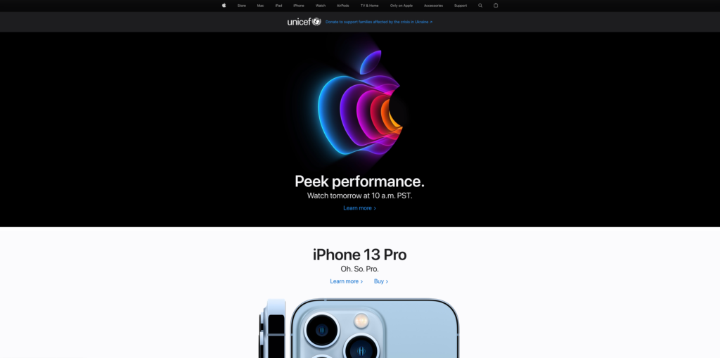
apple.com

- Good structure of information – easy to navigate and find what I am looking for
- Hierarchy – the most popular product people are looking for are on the front page
- Clean and simple design – easy on the eyes
Now take a screenshot of a website that frustrates you. Write down at least three things that are causing a negative experience.
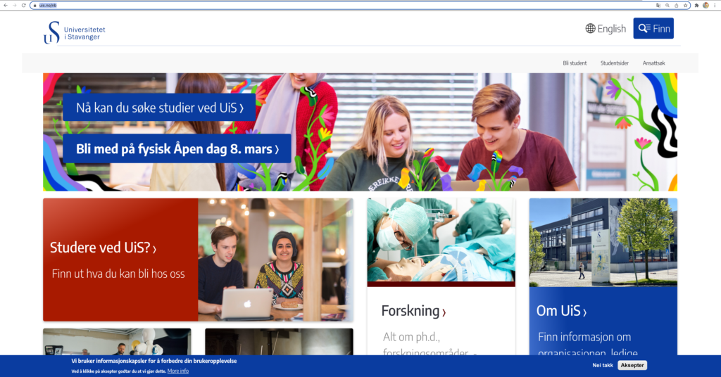
uis.no

- Bad structure and hierarchy of information – on the homepage there are panels all over instead of a list of categories to choose from, it is difficult to get an overview of the information available and to navigate the site.
- The site looks really busy and the information seems random, so again, hard to find information.
- The search bar doesn’t work well.
- When I am on a page and click to switch from Norwegian to English, the site jumps to the homepage – this is extremely annoying.
- The design is not logical or pleasing to the eye. It makes it hard for the user to find what they are looking for.


No responses yet