Task:
Compare the design (in terms of pace and contrast) of an online magazine, blog or website to that of a printed magazine, book or journal.
Pace – comprehension of the information in a design/layout (E.g.: long text vs short text)
Contrast – guides pace as it makes some items more noticeable than others (E.g.:headlines vs body copy)
- What differences can you see between the kinds of design strategies used in the two formats?
For the online magazine I looked at Vogue (https://www.vogue.com/) and Elle Decor (https://www.elledecor.com/). For the paper magazines I looked at Forbes and rom123.
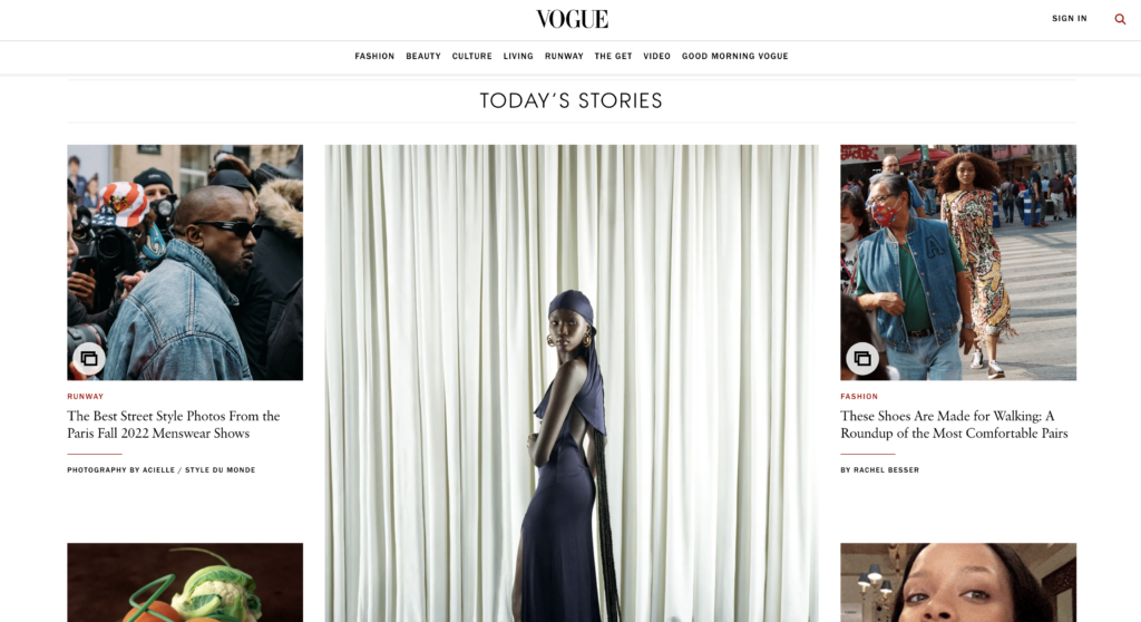
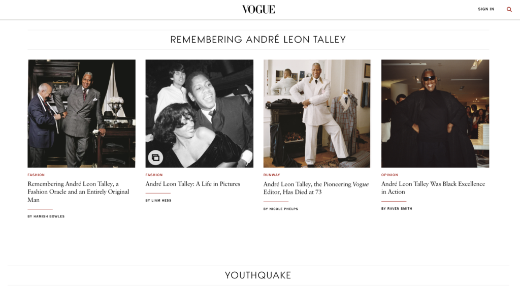
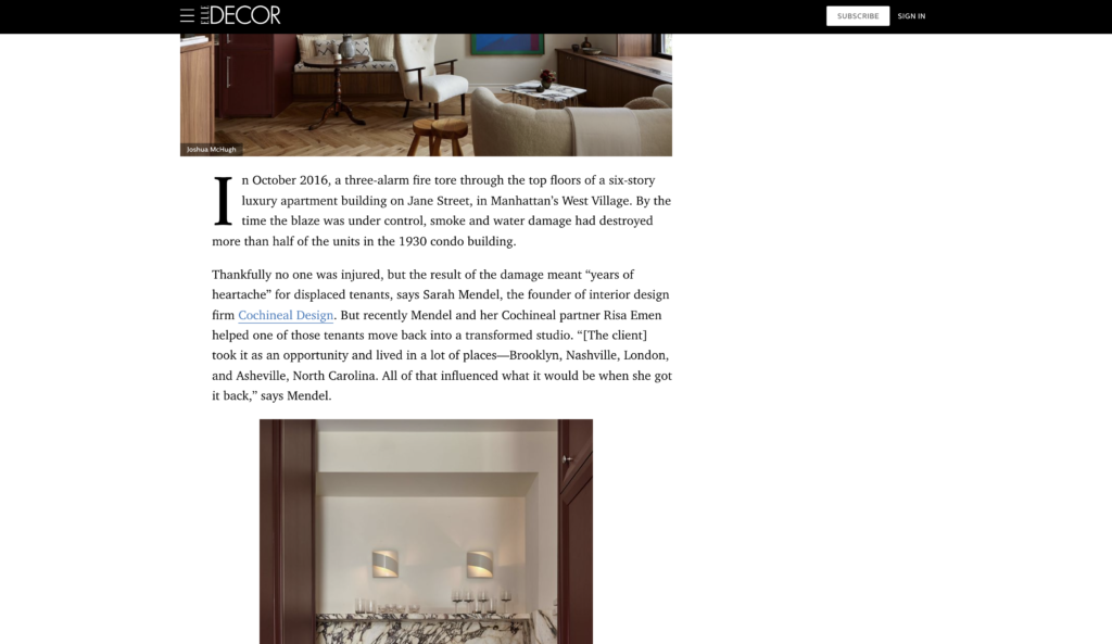
The biggest difference I see is that online magazines are more interactive and have a different structure and layout to accommodate many devices. There are different sections I can choose from in Vogue such as fashion, beauty, culture, etc. depending on what stories I am interested in. They only use headlines with a picture attached to grab attention. There are many stories side by side that I can choose from. Top stories may be marked as such; they come first and use bigger photos and fonts. Once I click on a story, the layout follows a simple format with the title being the largest, followed by text and images. Sometimes images can be viewed in a gallery format. On the side(s) of the page, there may be other stories listed or even videos attached (which are attention grabbing, but also distracting). It sort of reminds me of a youtube page where videos are listed side by side with titles (often click baits), and even after clicking on a video, there are additional videos listed on the side (if not watching in full screen). I feel like this format can actually make the reader a bit more impatient when reading a story because many more interesting headlines are asking for attention. It is very fast-paced, a bit like social media. The examples I looked at seemed to follow a very simple format when it comes to “design”. There weren’t any interesting design elements on the page, rather they consisted of text with simple fonts and images. Their main focus seemed to be providing content and keeping the viewer on their website by making them interested in the different stories. I find that images are the most attention grabbing and they are high pace. Contras is created mostly through the size of fonts and images.
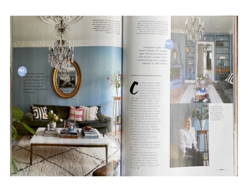
Paper magazines, although not interactive in the way websites are, create whole spreads with a lot more movement and interesting visuals. This is usually done through different grids and design elements. In rom123, images take up the majority of the space as the magazine is about home interiors. The major stories use more and bigger images. The text is minimal compared to the photos, but it does grab one’s attention. The first letter of each story is very large, which works both as a design element as well as an eye-grabber. This creates good contrast and the reader can quickly find where the article begins. They don’t really have advertisement pages, instead they create spreads with different furniture items and list where each item is from and how much they cost. The magazine also uses shapes such as circles, dots, stars, rectangles, etc. to create contrast and lead the reader to valuable information. This particular magazine is quite playful and versatile in its use of colors, fonts and placement of images and text. In general, printed magazines seem more free to have dynamic pages.

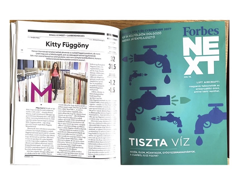
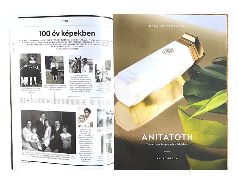
In Forbes, I also find a lot of variety in images, fonts, shapes, drawings, charts, etc., which all create contrast. These pages look a lot more involved than pages of an online magazine. There are many advertisements in this one, often taking up a whole page and the sides of the pages. Different textures and paper weights are also introduced, but mostly for advertising purposes. The headlines are big and well separated from the article and important quotes are separated, enlarged, and highlighted as well. I feel like the pace of this magazine is quite high, with lots of information and articles fighting for the reader’s attention. They use a lot of small design elements in order to lead the eye.
No responses yet