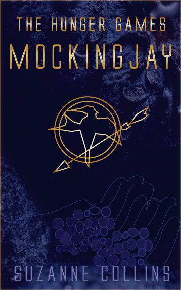
We had to choose from three books and I chose The Hunger Games. Since it’s a series, I decided to design the first book’s cover.
For this cover I wanted to challenge myself by creating a different colour scheme than what I would normally imagine for The Hunger Games, which would be black, red, orange, and yellow. We had to choose from one of the schemes we created earlier (in Part 1) so I decided to use complimentary colours. To the yellow I added a metallic sheen, making it gold. This symbolizes the wealthy and powerful “putting on the show” and creates a contrast between the rich and the poor districts represented. The blue represents loyalty, trust, sincerity, and faith, which are demonstrated by the main character, Katniss.
I wanted to include the main element associated with the first book – the mockingjay, but in a modern and simplified way as a symbol or signage. In the background there is a close up image of a berry with a blue colour overlay. I placed it there as a hint for the poisonous berries while also making it abstract enough that it’s difficult to spot. The texture and deep colour also reflects the dark theme which runs through the story. I wanted to make sure that it did not look dreamy or peaceful because the story is about control and a fight for survival, and ultimately – justice.
I added a very simple drawing of hands holding berries as well; another design element I wanted to make barely noticeable. It’s there to add some interest and mystery, not to stand out; so there is not much contrast used. The berries symbolize the way the story ends, but these images would not give anything away. Instead, they could make a person think of hunger and survival initially. Realizing their true meaning at the end of the book would be a fun surprise.


No responses yet