For this project we were given a list of 12 words to choose from. We had to create three typographic compositions, arranging each word to express its meaning, using only black and white. We had to make them fit on size A4, which I did, but I saved them as In addition, we had to come up with our own word, one that doesn’t exist, and create a composition for it.
This ended up being quite a fun exercise even though I initially struggled to come up with ideas. I worked on several words that I later abandoned because I was not satisfied with my ideas and sketches. Although we are learning about how to be creative at any given time, I still feel like my creativity level varies a lot depending on the day. However, I am working on implementing some ideas that I am learning about so I listened to some baroque music (would definitely not be my first choice) while sketching some of these, as suggested by the book “Creativity Now”.
Maybe it helped. 🙂
I started this project with some sketches. I had a lot more sketches for other words that I didn’t end up using, but for these I really liked the concepts from the beginning. Sill, as you will see, my end results turned out a bit different for some fo these. So, yes, the more sketches the better…which is something I really need to focus on.
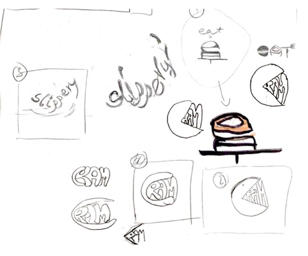
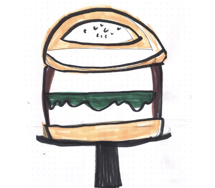
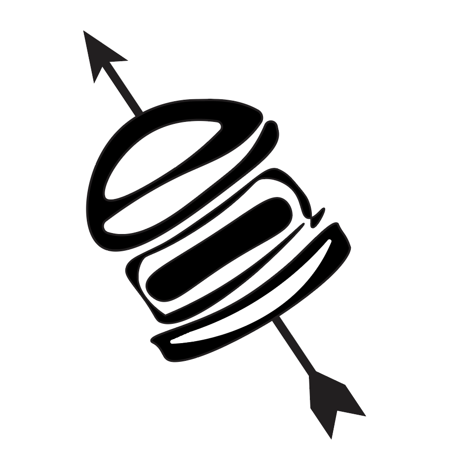
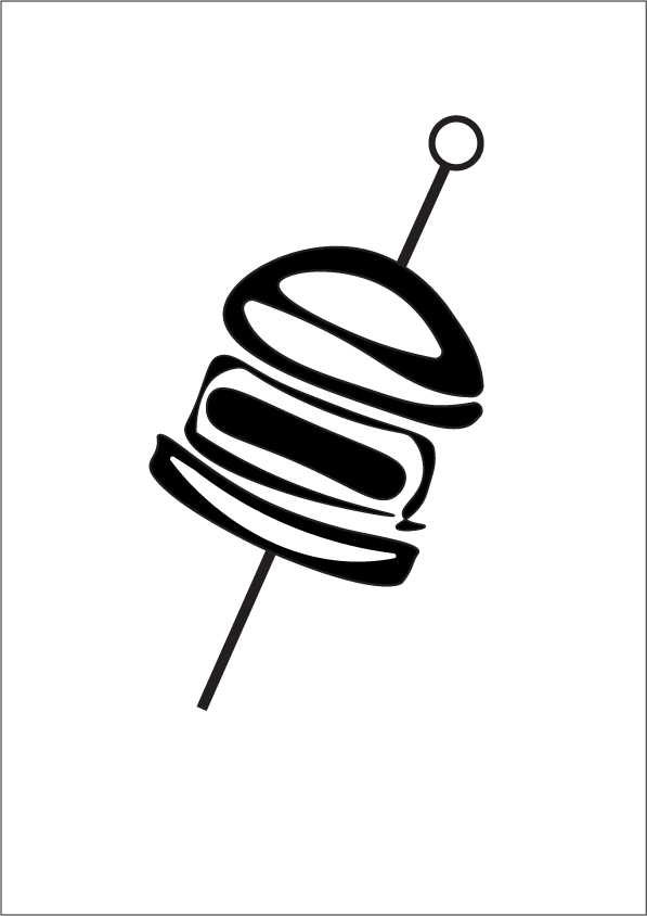
I first started working on the word “eat”. My initial idea was to make the word look like a hamburger. However, I struggled with the letter T. I wasn’t sure how to place it. I thought it could look like a plate, but I also needed a bottom for my burger bun, and I wasn’t sure if the negative space on the bottom of the A could provide that. So I decided to have the bar (I guess it’s called?) on the T create the bottom of the burger bun.
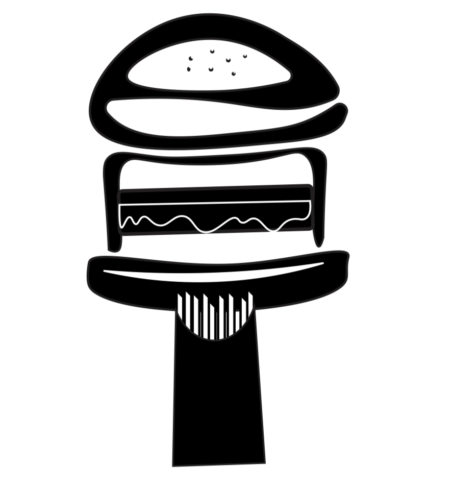
Then, I came up with the idea of the french fries, but I didn’t really dig the layout, the fries looked out of place at the bottom (they would make more sense on the side). It was also suggested that perhaps that wasn’t needed, but I had a hard time accepting that it could just be a “T” that didn’t really fit in the picture.
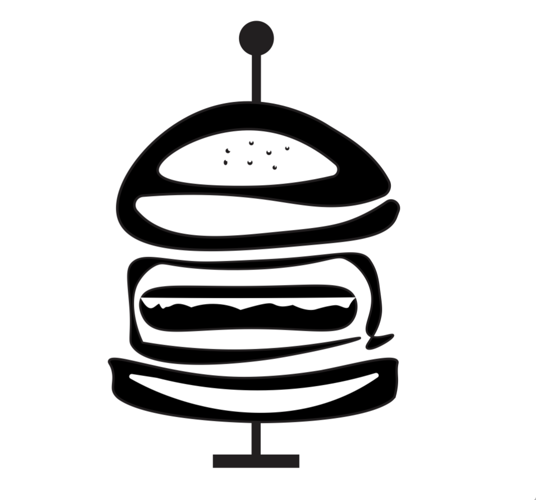
I tried pinning it, like when restaurants pin the burger with a toothpick. I also had the idea of having an arrow fly through it (which could be related to hunting for food). All this was in effort to “fix” the T. I wasn’t sure about these solutions so I kept going.
I am not sure if my final idea solved this dilemma either, but it’s the best I was able to come up with. The end product resembles a skewer. I removed the lettuce (or my try for a lettuce haha) and the sesame seeds from the “burger bun” so the word “eat” now resembles more abstract food items that could be on a skewer. The end of the skewer now functions as the “stem” in the letter T. The top part of the skewer? Well, that’s just extra. I hope this works.
Since this one was the most involved, I am including a few stages of the process below. It’s funny how the one I worked on the most actually worked out the least (imo), but that’s life.
 |  |  |  |
The end result for “eat”.
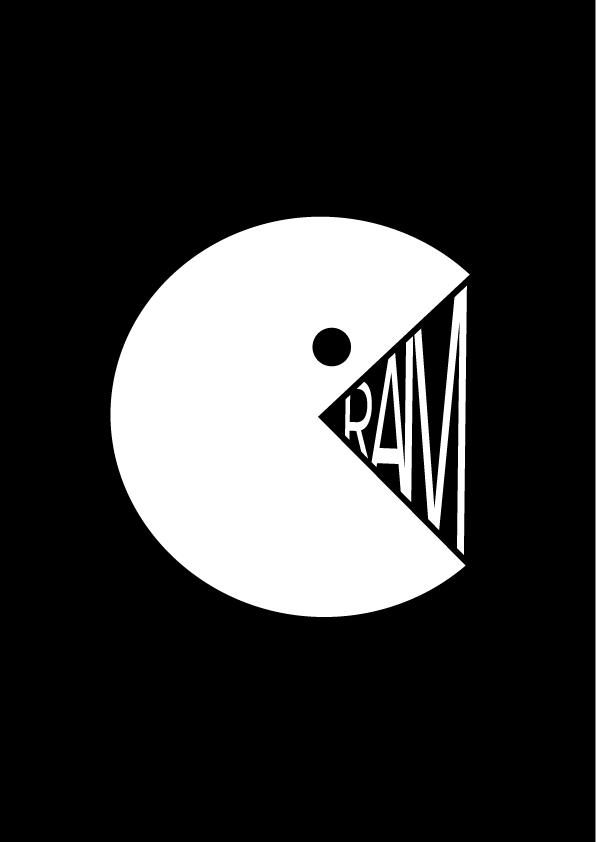
The second word I worked on was “cram”. I only ever used this word related to “cramming for an exam”, but I feel this image could resemble the idea for both cramming food or cramming “knowledge”. The PacMan is the “c”.
My first few tries were awful for this one, but I now love the end result.
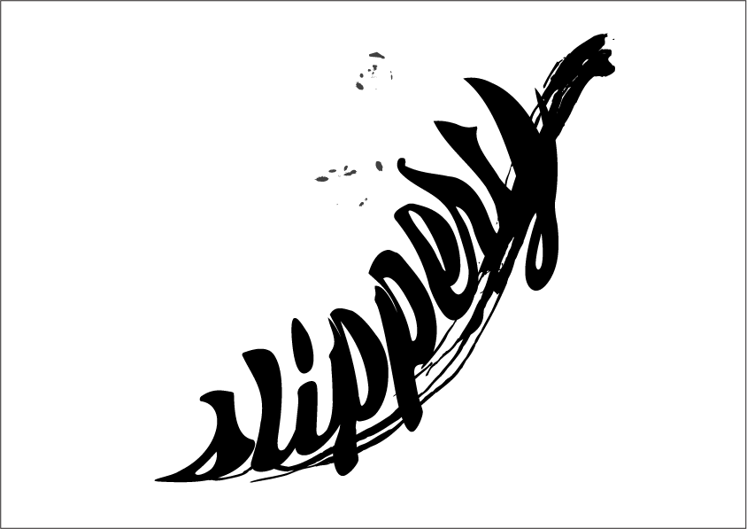
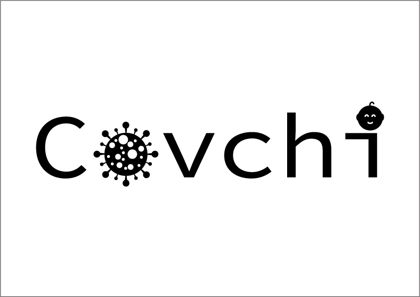
My made-up word is “covchi”, which could be singular or plural, meaning a child or children born during Covid. I love this one. 🙂
No responses yet