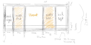
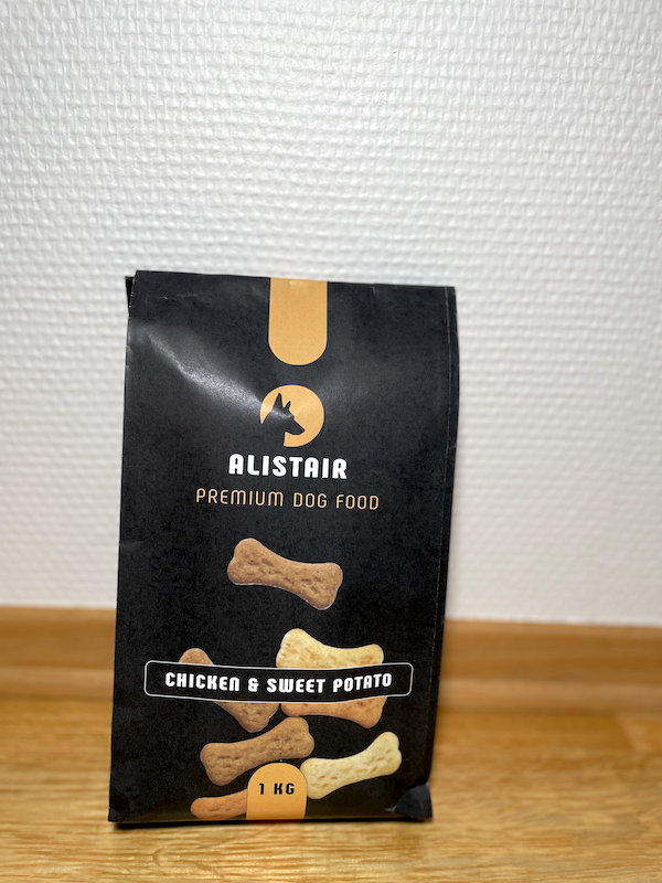
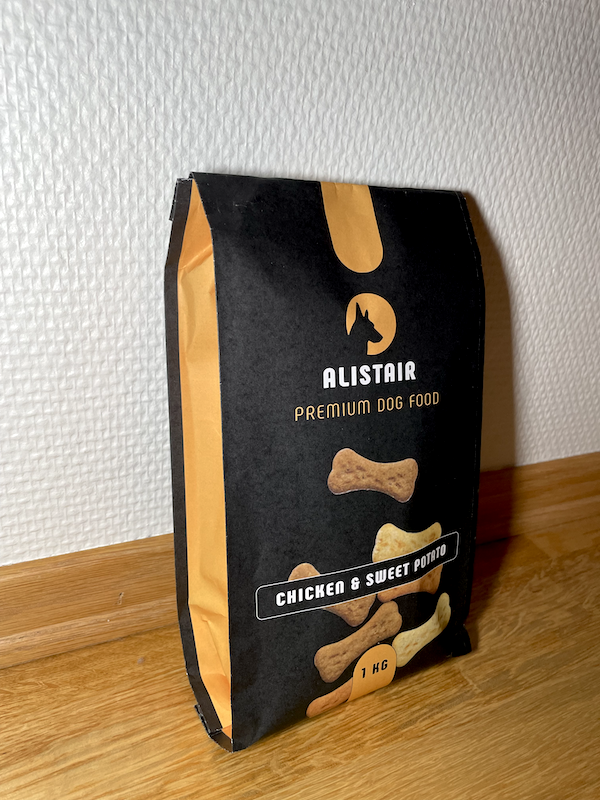
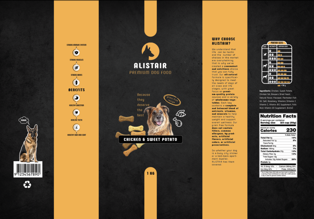
This week’s project was quite challenging, but also interesting. I was inspired by simple and clean designs. At first I looked for dielines online, but then I decided to take a coffee bag apart and measure everything because I believe that this type o packaging would work well for this brand.
I wanted to design something clean and simple as a way to quietly stand out, but finding the right balance was difficult to achieve. It took a lot of time, lots of trial and error, yet in the end I am not sure how the end result will be received. I tried my best, but I know this needs improvement.
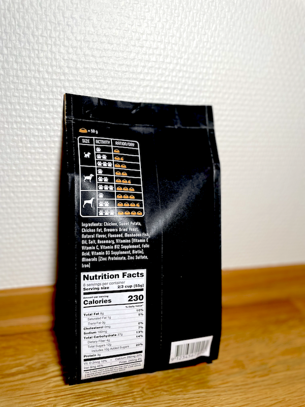
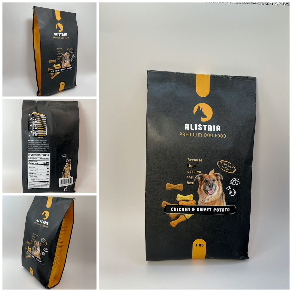
However, this exercise was especially useful for understanding how different everything looks on the screen. I knew this was the case but I didn’t think that I would be so off. For example, I thought that a size 11 font is the smallest I should go, but that ended up looking quite large when printed. Unfortunately, I also had to realize that my entire design should be scaled down. For this reason, I plan to make some final adjustments, but will wait until I receive some additional feedback.
For now, this is my packaging design.
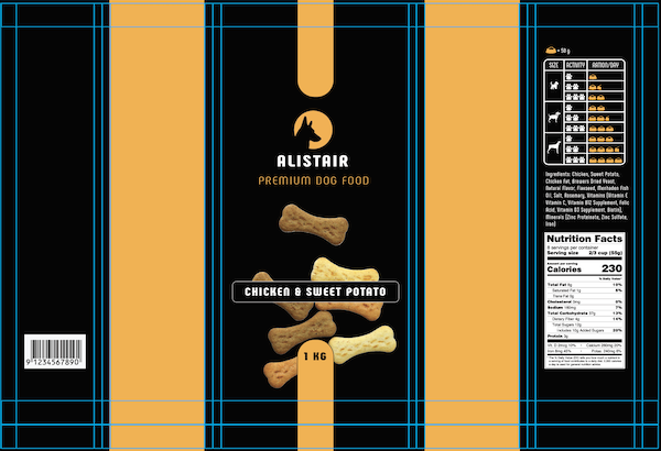
After the first round and some feedback, I came up with the following:
No responses yet