The task:
For this lesson task, take a look at this website: https://www.pennyjuice.com
Step 1
Go through the content on the website and conduct a content audit. List all the information and elements included in the website on a spreadsheet (like Google Sheets).
Here is my audit completed in Google Sheets:
Step 2
Now, plan the information architecture using the card sorting technique. You can conduct a simple card sorting session using pieces of paper (with the help of friends or family), or you can use an online tool like Miro. When you’re done with the card sort, analyse your results.
During this card sorting session I tried to eliminate all the redundancy and organize the information in a way that would make more sense to the customer and give a better overview. This meant re-arranging some of the information and adding to and re-labelling the menu bar. I am not sure if I should have sticked with the exact same list or not, but I decided to group things together into categories using quick explanations of what type of information I would include where. This gave me a better overview.
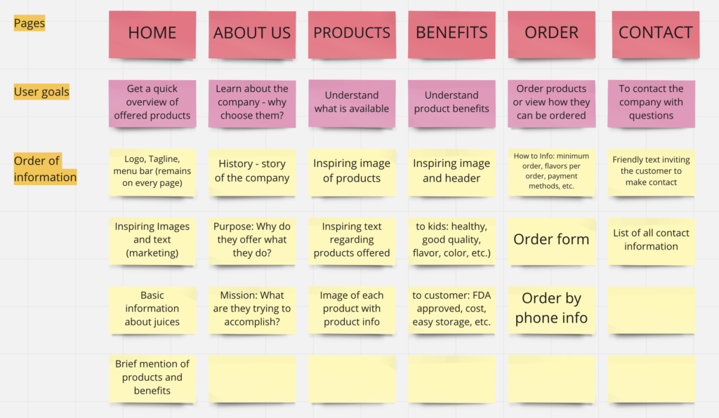
(The “About Us” page is something I added because it would be useful to include such information, but this is not currently included on their site and can be ignored.)
Step 3
Finally, take what you have learned and redesign the homepage along with the website’s primary navigation. Use the design software of your choice to create a flat design; it doesn’t have to be interactive. If you would like, you can also draw a simple diagram of the main steps you think the user will take (the user flow).
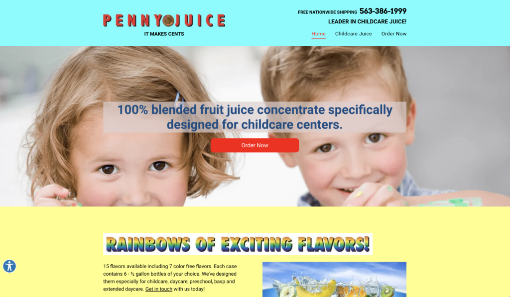
This is the home page I ended up creating in Figma. I don’t really know how to use this site yet and my design is probably not the best, but I think it’s a bit better than the original. 😉 (I guess that’s not hard to do.) I decided to use more pleasant and natural colors and make the site slightly more up-to-date. However, the point of this exercise was not the design but sorting the information in a way that would be most helpful for the customer.
Based on what I’ve learned so far and my preferences as a user, I came up with the following:
- I organized the information by topic, and in order to do so I added a few more pages.
- I decided to add the Order button at end of the menu bar (not as shown in Step 2) and make it more prominent. However, I decided not to add this button anywhere else on the page. One reason is that the page is short, and the other is that I find repeating this too many times rather pushy and off-putting.
- I added “Free Shipping” under the Order button as I believe every customer would be interested in this information and it’s best to include it next to the Order button.
- Each item in the navigation bar would change to a bold, green font when hovering over it.
- The top bar would stay on each page and the site in use would remain bold and green in the navigation bar.
- I added inspiring images in a more orderly way in order to create a better flow. I also focused on showing the product in use and building trust with higher quality images.
- I made sure the use of colors remained consistent. I only used a different color for “Free Shipping” as I wanted this to stand out.
- I used the same font throughout the site and a different font for the logo and tagline only. There is some variation in size and weight for the purpose of creating hierarchy.
- I only included some of the main highlights of the product in order not to overwhelm the user.
- I added a “Learn More” link that would take the user to the “Benefits” page. This page would have more inspiring pictures and include the benefits for the kids as well as the businesses/organizations purchasing the product.
- I simplified the links to their social media pages by just adding the icons.
- I added the contact information to the bottom of the page as that seems to be general practice. However, I did not make stand out as there is a page dedicated to this information as well.
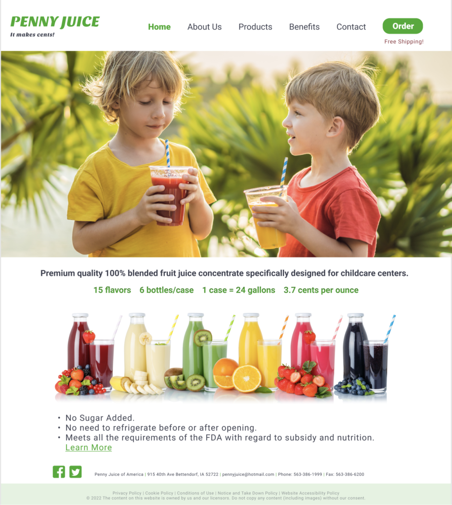
I made this page short, but it could be a bit more extensive when scrolling further down.
As a customer, I imagine that these are the steps I would take:
Home Page – Learn More (read benefits) – Products – (maybe read About Us) – (if convinced) Order
No responses yet