The Task
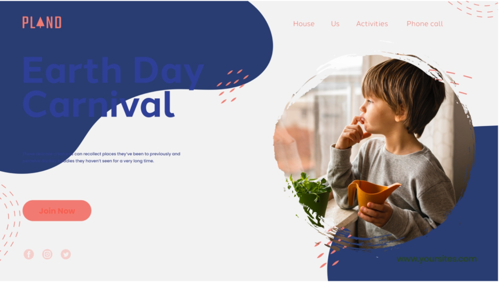
Have a look at the design below:

Consider the following:
- Do you think it is accessible to users with eyesight trouble? Would they be able to read the text comfortably?
No. Even with good vision, it is extremely uncomfortable and difficult to read anything on this page, especially anything over the blue background. There is not enough color contrast.
- What do you think of the labels of the main navigation? Do you think they are understandable and communicate clearly as to where they would lead a user?
I can understand what they might mean, but they sound weird and seem unprofessional.
My translation:
- House – Home
- Us – About us
- Activities – Programs (although activities sounds okay to me as well)
- Phone call – Contact Info
- Do you think the contrast between the background and text colour is significant enough to be accessible?
No, definitely not.
Step 1
- Do a straw test on the design by limiting your vision. Make your hand into a fist and look at your screen through the small space between your palms and fingers. Did you find it easy to read the information on the page?
No. I have good vision and even without this exercise it’s really hard to read anything, I would have to zoom in. Someone with impaired vision would not be able to read most of the text.
Step 2
- In your preferred design tool, recreate the website design. Pay close attention to the following:
- The text size of written content
- The colour usage and contrast. Text and elements should be easy to see and read.
- The labels should be understandable. The user should immediately know where they’ll lead them.
I decided to stick with the look and feel of the original design and focus on making changes to make it easily readable.

Step 3
- When you are done with your design, make your hand into a fist again and look through the small space between your palms and fingers to see if you can clearly read what’s on the page.
I am now able to read the contents of the page without any trouble.
Resources and equipment
Photoshop, Adobe Illustrator


No responses yet