Surf the web and pick three websites to work from:
- A non-profit organisation (for example a charity that cares for the homeless)
- A retailer (for example a clothes or flower shop)
- A service provider (for example a hairdresser, accountant or builder)
Answer the following questions for each of the three websites:
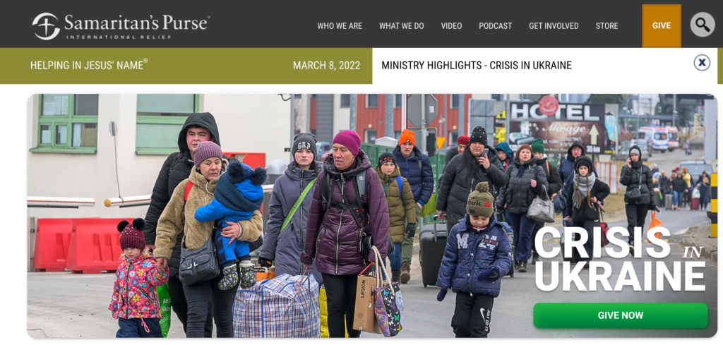
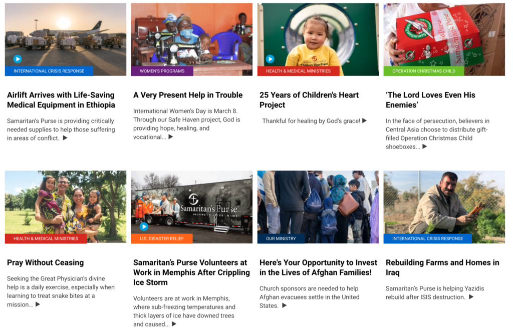
Non-profit: www.samaritanspurse.org
- What do you think the main goal of the website is?
- The main goal of the website is to make people aware of needs worldwide and to raise funds and other support.
- Share information about what the organization is currently doing and what people can do to help.
- Evangelize and represent the values of their Christian faith through acts of service.
- What elements in the design are helping the users meet the website’s goals? (Look at the calls-to-action, navigation, and other design elements.)
- They use good hierarchy in order to bring people’s attention to the most current crisis.
- They added a “give now” button which makes it extremely easy for people to donate money right away.
- Their page includes other stories and needs further down, but they keep their page fairly short, which helps give a good overview without overwhelming the viewer.
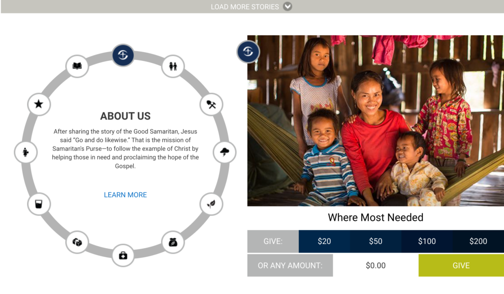
- On the bottom of their page, there is another donation section where people can give “where most needed”. This can be helpful to those who are more general in their approach of giving and trust the organization’s decisions regarding where it’s most needed. The listed amounts may also help them make quick decisions.
- Who is the main target audience? Name at least five characteristics that define this group of people.
I believe the main audience is Christians, especially those living in the U.S, but also anyone who wants to give to a good cause.
Characteristics: Christian, Generous/Giving, Caring, Service-minded, Compassionate
- How was the design used to attract this group of people? Discuss things like colour, font choices, photography or images, style and layout.
The fonts used are simple sans serif types. This works well for the site and makes the information easy to read.
Photography is used well to bring attention to needs as well as to share stories.
The layout is similar to a news article, and I think this works well for this orgaznization as their main focus is sharing news and stories. As mentioned earlier, they have good placement for donations as well, making it easy for anyone to give.
I believe their style is simple and conservative. They are focused on important issues so it is serious and not focused on being stylish or trendy. I believe this works well for their audience.
Their two main colors are dark grey and olive green.
As per Google, “Olive Green evokes space, wisdom and compassion for humanity. It is also associated with harmony, diplomacy and self-love. The colour has been shown to be associated with camouflage and the army, which in turn symbolises strength, character and also peace. Olive green represents also the traditional colour of peace.”
This really makes sense so perhaps this was an intentional design choice.
They also use some light grey, and what looks like burnt orange and green for the donation button.
In addition, they mark different categories with different colors, which organizes their articles. When a story under a specific category is clicked, the page shows other stories in that same category. It may not be all that pretty, but it can be helpful for the reader.
- How did you perceive this brand and its overall brand image? Was it serious and conservative or light-hearted and vibrant? Use your experience on the website plus any previous interactions you’ve had with the brand to motivate your answer.
I perceive their image as serious and faith-driven. Their attention is not on design, but on practicality and getting their message out in an organized manner. They make their goals and values clear, information is easy to find, and those coming to the site can quickly and easily make decisions.
Retailer: H&M
- What do you think the main goal of the website is?
Sales
- What elements in the design are helping the users meet the website’s goals? (Look at the calls-to-action, navigation, and other design elements.)
The layout is simple and user-friendly. The navigation panel is well organized and logical so it is easy to find what you are looking for. There are many filters as well that help speed up this process. Those who might just be browsing (not looking for a specific item) are inspired by images, inspirational pages, and articles.
They have a magazine, which can attract some people as well.
- Who is the main target audience? Name at least five characteristics that define this group of people.
I believe their main target audience is aged 15-35. They are looking for fairly good quality, but budget friendly options for trendy items, mainly clothing, but also some beauty products, accessories, and home decor items. While there is a men’s section, my guess is that most of their profit comes from women.
Some of their characteristics are: trendy, stylish, young, fashion-oriented, inclusive, affordable, fresh, current, urban
They have a “sustainability” section and seem to want to appeal to the ideology of the current generation in other ways as well. Models come in different sizes, shapes, and ethnicities. They are not showcasing their clothes on just perfectly beautiful models, so the brand is very much with the times and seems to embrace and spread the message of inclusivity and body positivity through their marketing style.
- How was the design used to attract this group of people? Discuss things like colour, font choices, photography or images, style and layout.
Their website’s design style, colors, and layout are quite simple. I believe their main focus is easy navigation and photography, which is done in fashion magazine style. They use very diverse models which appeals to their target audience. Catchy phrases and inspiration pages are also used to draw people in. The color scheme of the site is black/dark grey (text), white (background) and red (logo and highlights). The fonts are modern sans serif types which goes well with their style.
- How did you perceive this brand and its overall brand image? Was it serious and conservative or light-hearted and vibrant? Use your experience on the website plus any previous interactions you’ve had with the brand to motivate your answer.
This brand has a young and light-hearted feel. They are trendy, budget-friendly, up-to-date, cool, and popular.
Service provider: Sayso Hair Salon
What do you think the main goal of the website is?
To attract new costumers and get people to make an appointment. Also, to help current customers find information and book their appointments.
What elements in the design are helping the users meet the website’s goals? (Look at the calls-to-action, navigation, and other design elements.)
The first thing on their website is an image with a “make an appointment” button. This is their number one priority. They then use smaller blocks of images to bring attention to a well selected list of topics. These cover information customers are looking for, such as locations, price, popular services and promote their products, services and advertise membership. In addition, they have a navigation panel with some more information such as an “about us’, contact info, job opportunities, etc.
Who is the main target audience? Name at least five characteristics that define this group of people.
I believe their main target audience is working women, although they do men’s cuts as well. They promote themselves as “young and fun” and use words such as “innovation, quality, accessibility, creativity” and speak of themselves as “different and unique”.
Characteristics: quality over budget friendly, trend followers, working adults,
working adults who place great importance on quality service and are willing to pay a higher price for it. Many are looking for skilled hairdressers for special services.
How was the design used to attract this group of people? Discuss things like colour, font choices, photography or images, style and layout.
Color: red and dark orange and grey- the red color is bold and noticeable which helps them stand out
font choices: modern sans serif types – I think these work well
photography: they don’t have a lot of variety, but the photos are mostly good quality and they add a lot to the overall look of the site
The layout is quite simple with blocks for different topics, it is straight-forward and easy to navigate
I also went through the “schedule an appointment” page and it was not difficult to choose the salon, service and hairdresser.
I believe they use good hierarchy in the panel section as well “make an appointment”, “our salons”, “our prices”. I think this is a good order to place the information in. Also, I appreciate that they share their prices online, as when this is not the case I tend to look for another place. I do not like it when important information is hidden.
How did you perceive this brand and its overall brand image? Was it serious and conservative or light-hearted and vibrant? Use your experience on the website plus any previous interactions you’ve had with the brand to motivate your answer.
It is light-hearted and fun based on the website. However, I’ve been to one of their salons and while my hairdresser provided quality service and the salon looked fine, I did not find the design very exceptional or “young and fun” as they say. In fact, many similarly priced salons look a lot more fresh, unique, and modern. I personally did not chose them because their message or their design made me trust them, and based on those alone, I may have chosen another salon. I went there more so because I got the name of an excellent hairdresser who works there. So, although they promote themselves as “young and fun” and perhaps their hairdressers are younger, the design of the salon did not reflect this too much. However, I would go back to the same hairdresser.
Based on their website alone, I would assume they are a decent salon, but nothing super special. However, overall, I think people care more about whether the level of quality they are claiming to provide is actually there or not. So, going for the first time I would not fully trust them, but I would give them a try.
No responses yet