For this exercise we had to draw one or two squares or rectangles in an empty square to demonstrate the following visual effects:
- Entering left
- Movement to the right
- Movement to the left
- Movement downwards
- Movement upwards
- Balance
- Tension
- Symmetry/asymmetry
We had to provide at least two examples of each. In some cases, I forgot that we could only use one or two squares/rectangles and I added more; however, those are only extras.
My examples are below:
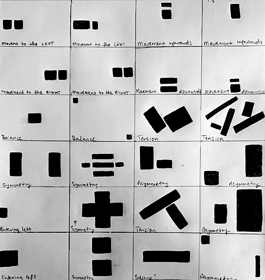
Moving the square to the very edge of the page creates a sense of entering from the left.
When more than one square is placed on the right side, it creates a sense of movement toward the right. Just one square might feel stationary, but two create a sense of movement.
When more than one square is placed on the left side, it creates the sense of movement toward the left.
When more than one square is placed on the bottom, it creates the sense of movement toward the bottom.
When more than one square is placed on the top, it creates the sense of movement toward the top.
When items seem to be moving in a direction, it can also create a sense of those items being on their way to “leave the page”.
Balance is created when the space around the shape(s) is equal on all sides, such as a square in the middle. This also looks stable and static; it does not create movement. Balanced designs create a sense of calm and are symmetrical.
Symmetry is created when objects are centered, leaving equal amounts of negative space around the object(s) on all sides, creating a mirror image. Symmetry aims to create calm, balanced, and more stationary compositions.
Asymmetric compositions are more dynamic, they create movement, tension, and are less rigid (as there are fewer rules to follow). However, even in asymmetric designs some level of balance can be achieved by using objects of similar visual “weight”, even if the objects look very different from each other and are placed on different sides of the page. In asymmetrical designs, negative space can more easily become part of the design as well instead of it feeling passive.
No responses yet