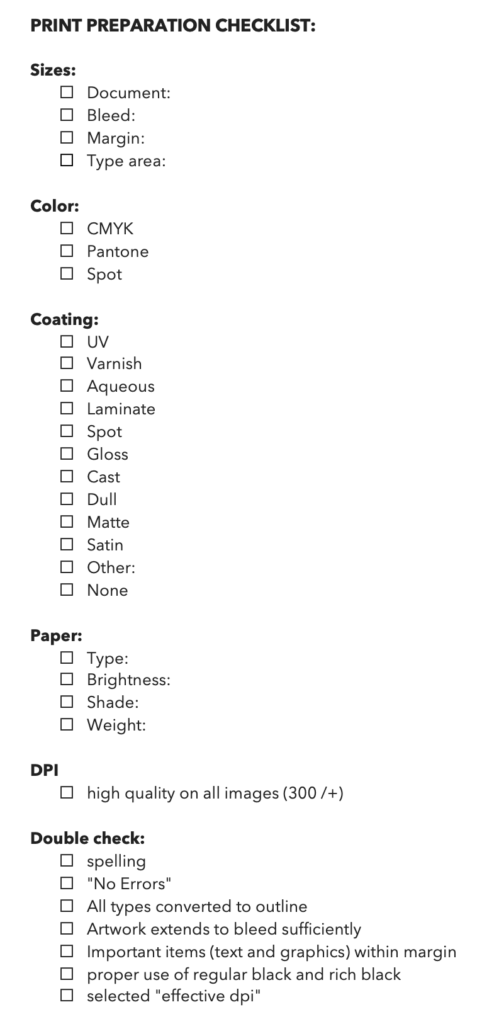
Design your own printing checklist form.
Decisions
As usual, this task starts with lots of research, this time related to some terms I have never heard of before. This was interesting to learn about, but it was also a lot of information, which for me takes quite a bit of time to read through, and not only understand, but remember.
My responses to these questions listed in the lesson are below.
1. Should the job be printed digitally or litho?
Litho for higher quality prints – making 2000+ copies
If I were to imagine that this brochure will be placed in stores throughout the country and many copies were needed, I would go with litho because I imagine this brand (Cloud9 Interior) to be a high end store. However, if I only needed a few copies, I would go with digital printing as it would be much cheaper.
2. If it is litho, will it be printed in CMYK or spot colours?
CMYK on every page except for the cover, where one spot color was requested (as per this assignment).
However, this could also depend on the quality needed, as spot colours can match colours much closer than CMYK and can produce more consistent results (this could be important for company colours), but they are not so good for full-colour imagery and can at times be more expensive. So, although CMYK is made up of 4 colours printed on top of each other and they are not as bright and accurate, I think they would still be the best choice in this case.
3. Will it be printed on high-quality paper or in a newspaper?
My brochure would be printed using higher quality paper – 170-200GSM, which is ideal for brochures. I would choose saddle stitching since it’s only 8 pages. It doesn’t really need perfect binding which is usually used for magazines with a lot more pages. I personally don’t find saddle stitching cheap looking either when a brochure only has a few pages. For example, I have some booklets from paint companies where very nice quality paper is used and the booklet is saddle stitched and it feels like good quality.
4. How much bleed is needed?
3 mm bleed (or up to 5mm)
Are there any specific PDF Presets? (Newspapers and magazines have different PDF presets than conventional printing (brochures, posters, business cards, etc.)
Just the presets listed below (further down).
What is the exact size of the printed material?
A5
Does your project have a specific die-trace or spot varnish? This needs to be set up in its very own spot colour and labelled accordingly in the colour list so that the printer sees it but doesn’t print it.
A varnish was requested for this project, and I need to figure out how to do this.
Are all of your colours mixed in CMYK (except for any spot colours required)?
The brochure/magazine has all CMYK colors and spot color on the front cover.
I thought that if I set up my doc in CMYK, then it’ll be all CMYK, but I need to understand the technical side of this a little better. Quote from lesson: “You can easily see in your swatches palette if you have any RGB colours you need to convert. This may occur for many reasons, like if you were given design assets from an outside source and pasted them into your InDesign doc. If the assets had RGB colours, they automatically get added.
What are your colour instructions?
4/4 (full color both sides)
Practical assignment
- Use the magazine-style brochure that you designed in Module 5. Add a spot varnish to the cover and change the design to use a spot colour (you are welcome to make layout changes if you want to).
- Upload the print-ready PDF to your blog and post screenshots of your packaged files and instructions.
- Make sure to include the instructions (like spot varnish, paper choice and binding) in the file.
All of this was a bit too much for me to do, so I will need to continue with this.
InDesign pre-PDF checklist (as listed in the lesson):
- Document size
- Bleed size
- Artwork is extending into bleed sufficiently – I had a lot of issues with this because I did not have it pulled all the way before, it’s fixed now, but it has changed the design a bit
- Type area (live area) –
- Colour swatches (CMYK or Spot/Pantone) in colour list are correct and unused colours have been deleted
- regular/rich black
- Images are CMYK
- “Effective dpi” has been checked on all images (needs to be 200-300dpi, preferably 300dpi) – check this with your printer. Note that when checking dpi, it will show you “effective” and “actual”. You need to check the “effective dpi” (see below). For example, if a 300 dpi image is scaled up 200%, the effective dpi will be a lot less than 300dpi.
- Spell check – It is good to run an automated spell check as a precaution to see if anything unusual pops up that someone may have missed in the checking process.
- “No Errors”: There is a feature in the footer of InDesign that picks up any issues with the doc like missing fonts, images or overset text. This light must be green (see below).
- Finally, all type should be converted to paths/outlines. There is a range of ways to do this. There are ways you can set up a preset that converts the text only in the PDF and not on the working document (this is useful for docs with lots of text, like brochures) and then there is the manual way of selecting text and converting it. If you use the manual way, make sure you duplicate the text onto another layer in the layers palette to avoid losing the original text version. One of the worst things you can do is convert text to paths and then save the doc, close it, and open it up again to find you don’t have the editable text anymore. Imagine recreating a massive brochure or annual report because you no longer have the original text version!
Step 1
- Choose your PDF preset.
- Make sure you label your file correctly and send it to the right folder.
- The two main areas for you to check are the “General” and “Marks and Bleeds” categories (far left). Under “General”, you nominate your pages – either “All ” or you choose a “Range” like 1-2 or 1-5, 3-4 etc. If you want to do a PDF as “Spreads”, you need to check that box – this is relevant if you have facing pages for a magazine layout, for example, and you want to send a PDF for the client to review. It is then better to send it as spreads for them to be able to visualise the layouts. However, when sending to print, you would not send it as spreads but as single pages. You can also check the box that says “View PDF after exporting”, which will open it up automatically, once processed, so that you can check it.
- You then need to check your “crop marks” and “use document bleed settings” to make sure the PDF includes the bleed settings you created in the design file.
- You are now ready to export! Simply click the “export” button.
- double-checking that no text is still set as a font – sometimes we miss a few that were not converted to paths/outlines. You can check this by going, in Acrobat, to File > Properties and then to the Fonts tab to see if it picks up any fonts. As you can see in the below image, you want this to be empty.
Resources
https://www.alocalprinter.co.uk/faq/litho-and-digital-differences
https://www.caseyprinting.com/blog/how-to-pick-the-best-paper-for-your-brochure
No responses yet