For this task, we were asked to use the mood board previously created for a fictitious fitness coaching brand as inspiration for a logo.
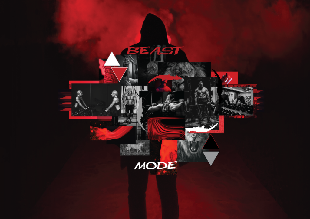
Moodboard
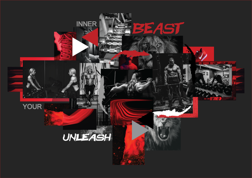
Secondary Moodboard
Logo Design
The fitness brand I created is called Beast Mode. The keywords for this brand are fierce, powerful, driven, engaging, and empowering. Their main target audience consists of young, active individuals (65% men) who aim to gain muscle, achieve optimal body composition, and maintain an overall healthy lifestyle which involves a healthy diet sufficient sleep, as well as support and encouragement for good mental health.
Due to what I have been learning about logo creation recently, especially the emphasis on simplicity, I decided to create something that doesn’t involve weights or other “fitness type images” or any image for that matter. I went for a modern, clean, and simple look that is easy to recognize. This logo is a word mark which also looks like a symbol because it is sideways.
When examined more closely, some interesting elements can be picked out about the design. The two triangles make up the letter B (on its side) and the mountains make up the M. The mountain image represents the journey, dedication and progress during the fitness journey. The logo as a whole looks a bit “beasty”, making the triangles look like eyes.
Finding a font wasn’t easy, but I got some help from a teacher, which helped me look in the right direction. The white triangles in the B correspond with the white text for “beast” and the red M corresponds with the red letters in the word “mode”. The typeface is Brother 1816, black is used in the logo and extrabold is used for the tagline: unleash your inner beast.
The tagline helps to build the image of the brand and inspire people in a serious yet also somewhat funny way to reach deep and find the willpower, discipline, and dedication needed to achieve their goals and dreams.
No responses yet