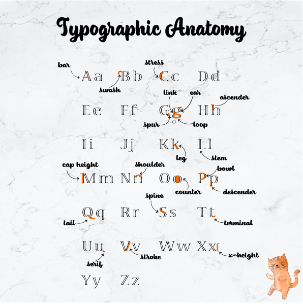
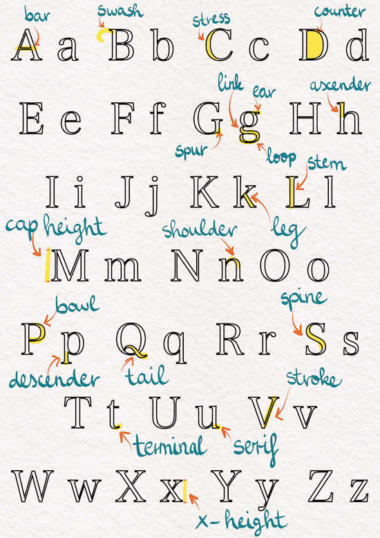
This week we learned about typography and one of our exercises involved explaining the anatomy of type visually, using the entire alphabet (upper and lower-case). Doing this exercise has definitely helped in not only becoming aware of them, but memorizing them as well.
Using colour, I marked the following on the alphabet:
- Arm/leg
- Ascender
- Bar
- Bowl
- Cap Height
- Counter
- Descender
- Ear
- Link
- Loop
- Serif
- Shoulder
- Spine
- Spur
- Stem
- Stress
- Stroke
- Swash
- Tail
- Terminal
We had to use size 210×210 for this exercise so the image turned out quite blurry, but I guess the main point was to get acquainted with these terms and practice using the programs.

This image shows my initial work on the iPad, before I completed the exercise in Adobe Illustrator.


No responses yet