Among all the tasks we had to do this week, we were assigned to research the history of graphic design. In this post, I will cover five key events of new styles emerging that greatly impacted modern graphic design.
Expressionism
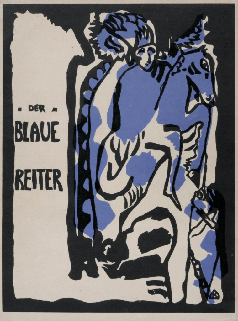
Expressionism started in Germany and Austria around 1912. This style is non-realistic in its approach and it focuses on bringing forth emotions. This style brought a break from the Realism tradition that began in France in the mid-nineteenth century and was also a rebellion against it. This style was vibrant, dynamic, adventurous, dramatic, and unafraid of clashing. It used distortion, fantasy, primitivism, and it sought heavily to reach deeper and express strong emotions. I enjoy how this style feels and how it is not focused on perfection and creates a new and interesting look, yet I find that in the early examples there is often something dark about it as well. Over all, I think this idea was successful in breaking down conventional ideas and it created a new normal in design.
Source: https://99designs.no/blog/design-history-movements/expressionism-in-design/
Early Modernism
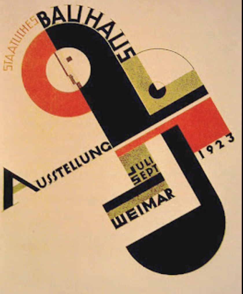
This style also emerged in the 1910s and was a break from tradition, often described as “avant garde”. A common thread was dissatisfaction with the past and a need for change in society. The big shift in the look of design created the feeling of a different and new era. Modernists loved using clean, geometric shapes, and had a minimalistic approach. They style also made sans-serif type popular. Proportions were often distorted/exaggerated and applying great contrast was a huge part of this style as well. Photography was widely used and the dominant colors used were red and black. I personally love and admire this style.
https://sites.uni.edu/fabos/idc/graphicdesignstyles.htm
Late Modernism / New York Style
This style emerged at the end of WWII in response to trends in ITS and Modernism. It was dominated by American innovators who used a new, more playful method for advertising, marketing, and packaging. It was also inspired by European immigrants who brought new approaches to this highly competitive environment. Another influence was the advancement in photography, printing, and typesetting, which created even greater possibilities for exploration. This style was simplistic and it used organic shapes along with geometry. Conceptual typography also became a popular form of expression.
https://courses.lumenlearning.com/suny-graphicdesign/chapter/1-7-late-modern-new-york-style/
Source: https://bhattifaizan.medium.com/graphic-design-styles-fa85aff1ff69
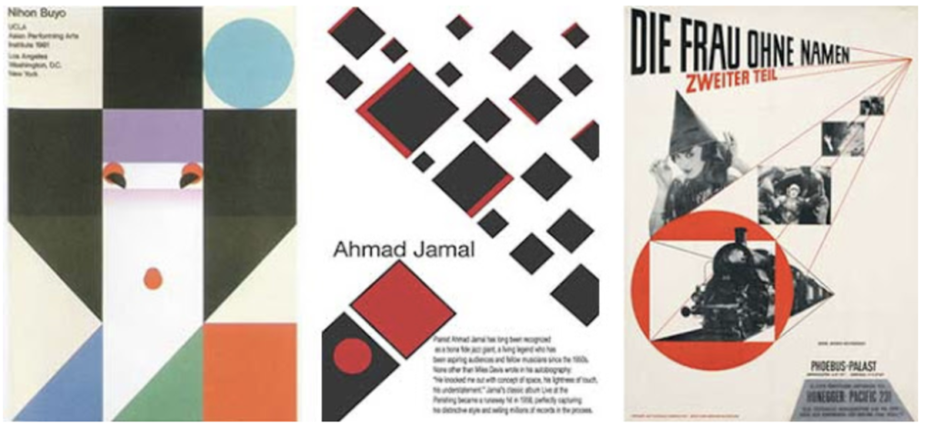
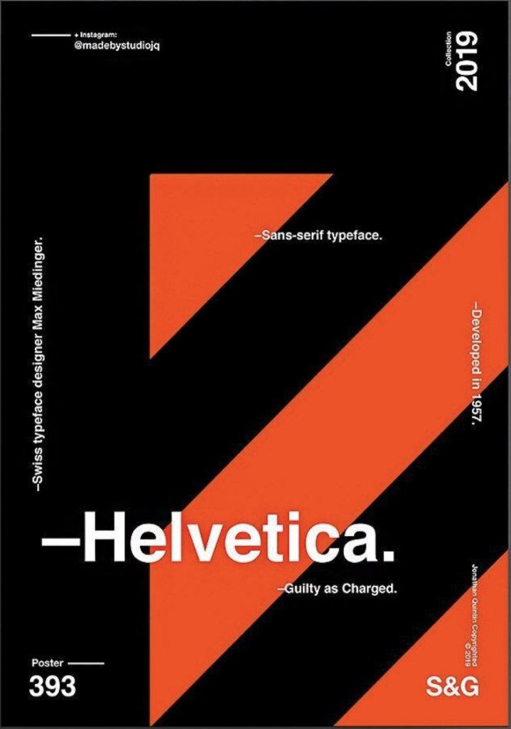
Swiss / International
This style has a “less is more” approach which asks the question: “what could be removed from it?” It usually uses an asymmetrical layout, sans serif typefaces, and lot of negative space. It favours photography over illustrations and has a simple, clean, modern, and minimalistic approach. The Helvetica typeface often comes to mind when thinking of this style as it is one of the most used typefaces to this day. This style also puts great emphasis on hierarchy and aims to make the viewer catch the most important information first. I believe this style emphasizes the most important ideas in graphic design today.
Source: https://journal.projectnord.com/blog/everything-you-need-to-know-about-the-swiss-style-xbPHo
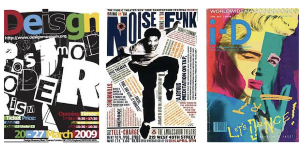
Post-Modern
This style is an unconventional, sort of hodgepodge of styles that often uses collages/collage like illustrations. It overlaps elements, tilts images and text, and creates a free, careless, playful yet rebellious vibe. Although this may have seemed like a mess initially, it really caught on and became a new way of designing starting in the 70s. This reminds me of a maximalist approach, which if used correctly, can create fun, unique, and eye-catching designs.
https://bhattifaizan.medium.com/graphic-design-styles-fa85aff1ff69
No responses yet