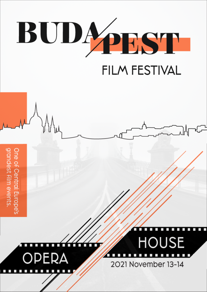
This project involved designing a poster and pamphlet for a film festival. We were free to decide about the details of the event so I chose a regular film festival held in Budapest, the capital of Hungary. My goal was to create a somewhat modern and minimal poster design. I first created an outline of the city, then decided on the type for “Budapest”, which is Elsie Black in all caps. I used this type in a couple of places on the pamphlet as well; everywhere else I used Broadacre Regular 0 in different formats. I later added the film strips and then the details in orange. I could have worked on the kerning between a few letters as well as the placement of some design elements, but I ran out of time. Because I am completely new to Adobe Illustrator and I am just learning by doing and watching tutorials, this took me quite a lot of time.
A bit more information about my design choices: Buda and Pest are divided by the Danube River, with Buda located on the west side and Pest located on the east side. These two parts are often referred to separately as well, so I wanted to symbolize this by dividing the two. I also thought this would create an interesting design effect. In addition, the event is held at the Opera House, which is on the Pest side, therefore Pest is highlighted. I chose a white, black, and orange color theme. Because I had quite a bit of white space left, I decided to add a picture with 10% opacity to the background. This is a free image of the Chain Bridge in Budapest from Unsplash, taken by Daniel Olah. I believe this addition helped to fill in the area that felt a bit empty and I hope it added some interest without distracting the viewer.
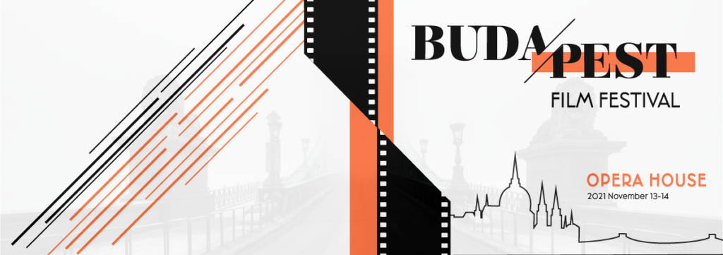
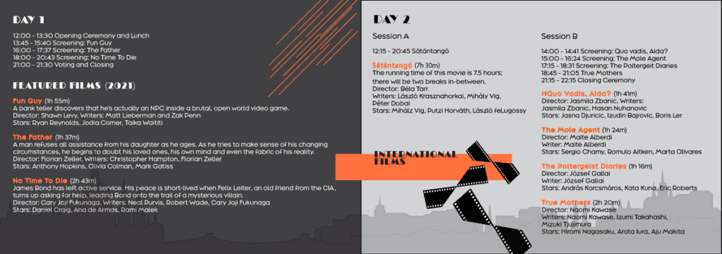
For the pamphlet I chose a landscape format and designed the cover (front and back as seen below) and the inside with the program information. For this design, I added a bit of grey in addition to the white, black, and orange theme just to create more interest.


No responses yet