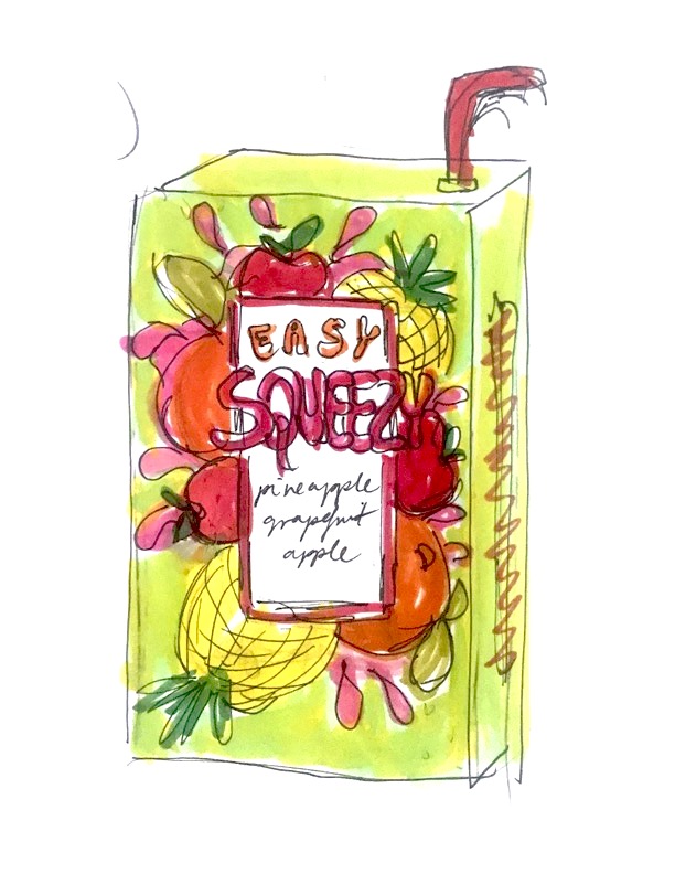
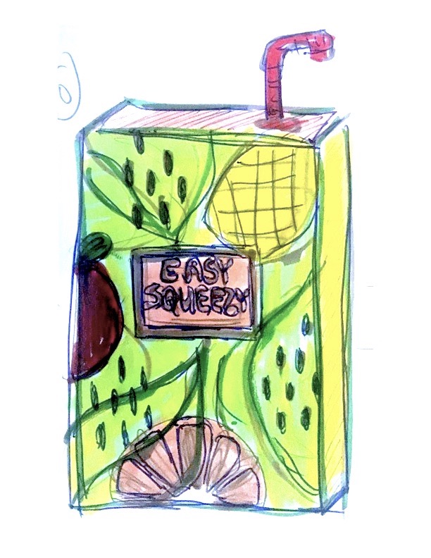
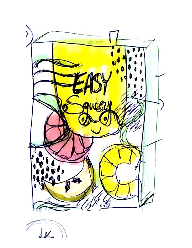
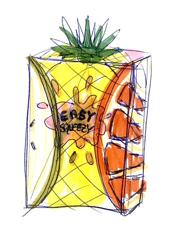
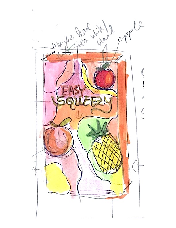
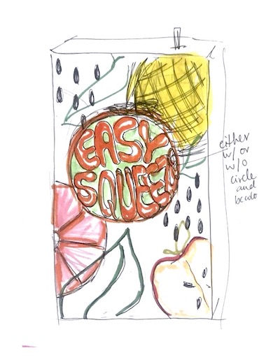
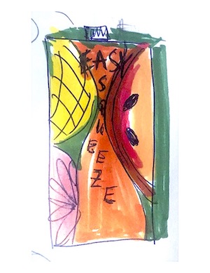
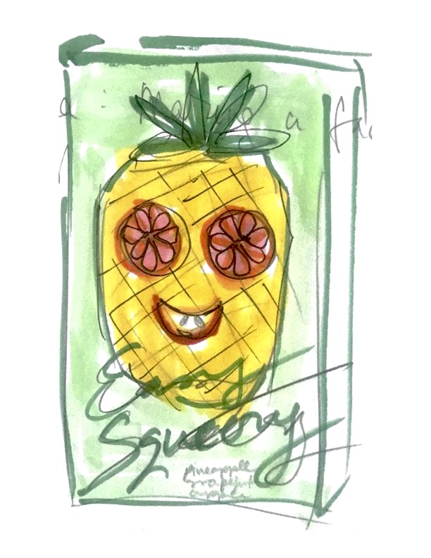
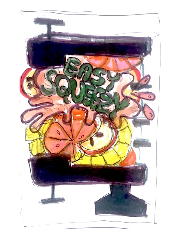
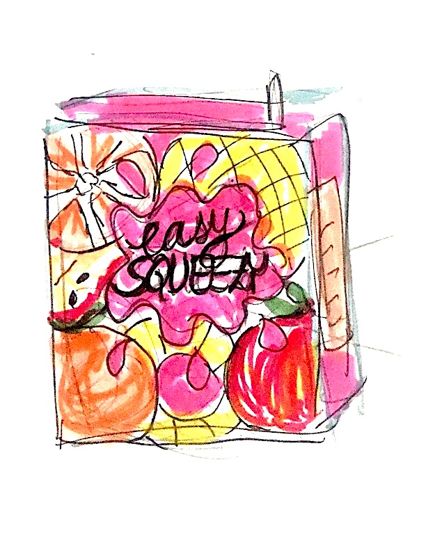
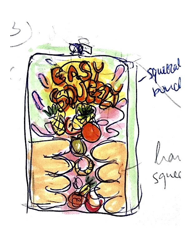
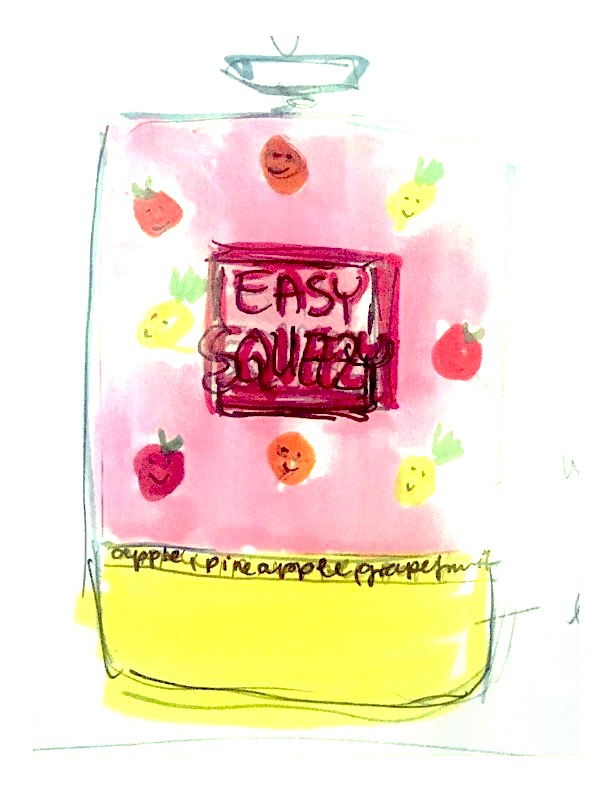
This was a fun but also difficult exercise where we were given a task to design packaging for a juice box (apple, grapefruit, pineapple flavour). The fun part was sketching different ideas and the difficult part was choosing an idea and work it out in detail. I will first include my (bit messy) sketches below.
 |  |  |  |
 |  |  |  |
 |  |  |  |
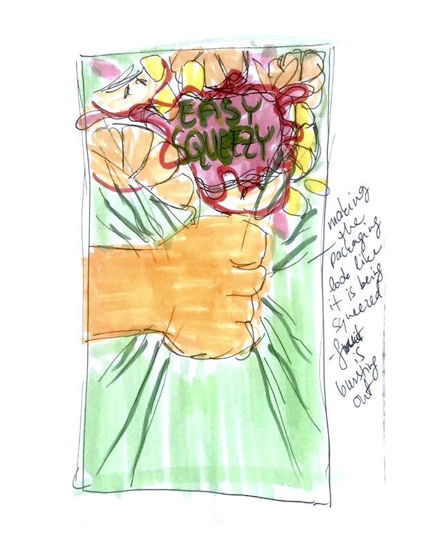 | 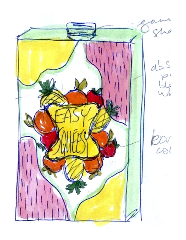 | 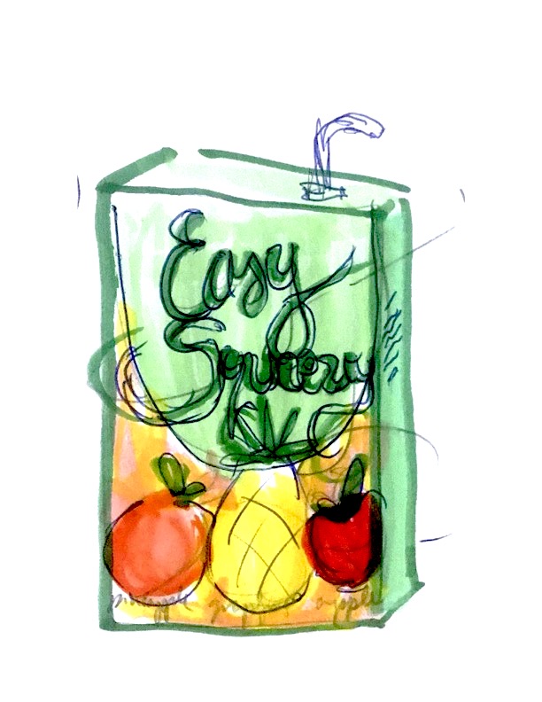 | 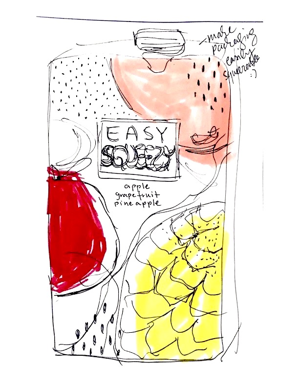 |
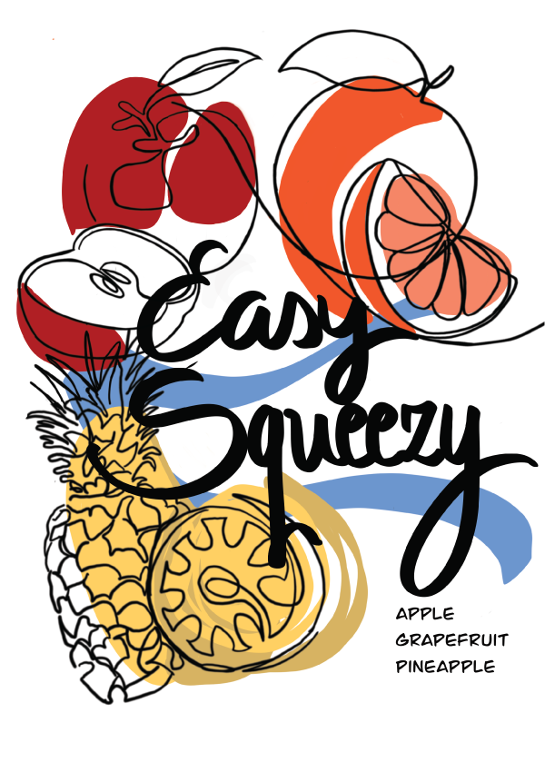
While I had a lot of colorful ideas, I eventually decided to go with a cleaner, more simplistic style that somehow feels both modern and retro to me. My last sketch on the right was the initial idea that I developed further.
I wanted some free-flowing line drawings with colors placed in a somewhat random fashion, making them off-set on purpose. I imagined adding some abstract shapes around the box as well, but they seemed to make my design too busy, so in this case I decided against them. (Perhaps this could have worked by simplifying the drawings even more and only showing a small part of each fruit, making them look more abstract as well.)
At one point, I added color to the leafs, but again this seemed to complicate the design and I wanted it more simple. I also tried a few fonts for the name, but they did not seem to represent the easy-going, playful style of the brand so well, so I decided to use my less-than-perfect handwriting instead.
When I was mostly done, I knew something was still missing, so I played around for a while trying to fill in the empty parts. This was a challenge, but I finally chose to add some contrasting strokes which created more balance. I wanted the color of the strokes to be different/unrelated to the fruits in order to set them apart and help them stand out; for this reason I opted for blue.
Over all, I feel this design goes well with the name “Easy Squeezy”, which creates a sense of ease and flexibility.


No responses yet