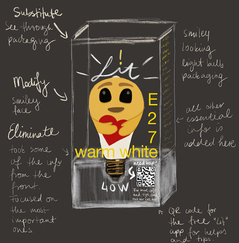
This lesson involved designing packaging for a lightbulb that does not currently exist on the market. In order to practice the SCAMPER method, we had to apply each and write about our findings. We were asked to choose the method that we thought worked best and sketch our packaging idea.
Substitute something – What can be replaced to make it better? Replace one part of the product with another that works better.
The material of the box could be made of a different material. For example, a see-through box made of recycled plastic or biodegradable PLA plastic. This would help the customer see the entire product.
Combine it with something else – What can be combined? (what ideas, products, materials, etc. could you combine?) Put different components together to improve the product.
One idea would be to combine the package with an environment-preserving campaign, where customers would be encouraged to return the used light bulb in the same package to the store, and could receive loyalty points as an incentive. Each package would display the number of loyalty points that could be earned. Alternatively, these points could also be donated to charity.
I also had the idea of the packaging looking like those little white houses for candles. Combining the idea of the bulb making your home cozy, just like those candles create a cozy home. In Scandinavia especially, the idea of a cozy home is really important, so photographs of beautiful homes with great lighting could be considered as well.
Adapt something to it – What can you adapt to make an improvement on the original product? What new element or function can you add? Update the product to new customer preferences.
People may not be familiar with some of the measurements that are typically displayed on the package (e.g., lumens or kelvin). A free app, downloadable by scanning the QR code printed on the package, could be included with more information about lighting in general, as well as useful tips and guidance on which lightbulb to choose based on the customer’s needs or taste.
Modify or Magnify/Minify – What can you modify/change about it? How can you make it different? Change how the product looks, its appearance and presentation.
While keeping a cohesive brand identity, the packaging could be slightly modified based on the audience. The same brand could have different lights and packages depending on whether they are for adults, youth, or children. It could also have a “green” line where environmental effects would be in focus. For children, the package could have fun drawings or a little light bulb cartoon story on them.
One idea would be to use see-through packaging with smileys printed on them. This would make the bulbs look like smiley faces, thereby creating a new and fun look. If the branding involved smileys, promotional smiley stickers could be included.
The packaging could be cylinder shaped to make the light bulb stand out among the usual cuboid boxes on the shelf. This shape would still be practical when considering the usage of shelf space and ease of stocking.
Put to other uses/another use – What other purpose could it have by using the materials that are already there? Use a product for a purpose for which it was not designed.
The packaging could serve as a small décor item or something to hold other items in. This could be done in different ways, depending on the target audience. For example, for kids, the box could an animal looking design or the packaging could be folded in a way to form an animal. For men, the box could function like a drawer to store and organise small items or tools (e.g., screws and bolts).
Eliminate something – Is there anything that is unnecessary and could be removed/simplified? Get rid of parts of the product that are almost useless or not valued by clients.
Unnecessary or overwhelming information would be removed from the front side; it would focus on first impressions and information customers usually check first. Additional information that not everyone is familiar with or might be confusing for some would be added on the other sides of the box.
In order to minimize packaging, the sides could be kept open.
If it is required to provide safety information in a printed format, the inside of the box could be utilized by making it fold out easily to read additional information.
Reverse, Rearrange, Reengineer -What could be reversed/flipped, processed backwards, re-thought? Deconstruct the product or re-thing some of its main pillars.
The core assumption behind light bulb packaging is that it is in a paper box of a cuboid shape. Re-thinking these main pillars could mean changing the shape and/or the material. A radically new approach would be to use a wood box filled with popcorn as the packaging. (Note: this idea may also be considered as modify or put to other use.)
For my final product I used a combination of ideas mentioned above, which I highlighted with a different text color.


No responses yet